Das Gesetz der Nähe
guter Artikel aus: www.ch-becker.de - Vortragsseminar
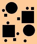
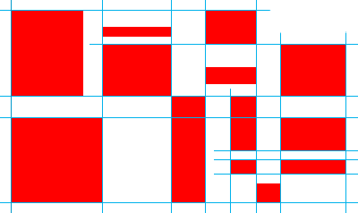
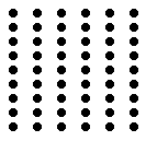
Es besagt, dass gleiche Elemente (Elemente mit gleichem Reiz) mit geringeren Abständen zueinander als zusammengehörig wahrgenommen werden. In Abb. 3 sehen wir links eine Anordnung in Zeilen und rechts in Spalten .. Alles nur, weil die Elemente sich näher sind.

Gesetz der Nähe
Artikel aus: kadekmedien.com
Das Gesetz der Nähe besagt ganz allgemein, dass nahe beieinander liegende Elemente von unserer Wahrnehmung als zusammengehörig interpretiert werden. Entfernt liegende Elemente werden hingegen als unabhängig voneinander wahrgenommen.
Aus diesem Sachverhalt lässt sich schlussfolgern, dass für unsere Wahrnehmung auch der Zwischenraum Grafiker benutzen im Hinblick auf den ungenutzten Teil eines Layouts auf dem Papier den Begriff Weißraum eine entscheidende Rolle spielt und nicht etwa einfach nur Platzverschwendung ist. Die Leere erweist sich nämlich als ordnendes, Orientierung ermöglichendes Element. Daher ist es auch nicht sinnvoll, in ein Layout soviel Information wie nur irgend möglich hineinzupacken.
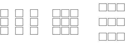
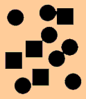
Neun Quadrate jeweils unterschiedlich angeordnet: links je drei Quadrate in drei Säulen, eine vollständige quadratische Anordnung in der Mitte, und drei Zeilen je drei Quadrate auf der rechten Seite.
In der Gestaltung bietet sich dann auch die Möglichkeit, zusammengehörige Elemente als eine (Sinn-)Einheit zu gruppieren. Solche Gruppierungen vereinfachen die Komplexität der grafisch aufbereiteten Information und machen sie so leichter erfassbar.
Gesetz der Nähe
Artikel aus: Mediengestalter/in Digital und Print (Dieser Artikel nicht mehr online)
In unserer Wahrnehmung werden Elemente, die nah beieinander stehen, zu einer (Sinn-)Einheit zusammengefasst.
Nähe eine Methode in der Gestaltung, die Zusammengehörigkeit von Elementen zu verdeutlichen, denn die nahe zusammen liegenden Elemente werden als Gruppierung oder Einheit interpretiert. Umgekehrt betont die Entfernung von Objekten zueinander die Unterschiede.
Gruppierungen, die sich durch das Gesetz der Nähe ergeben, reduzieren auch die Komplexität der Gestaltung; der Betrachter kann die Beziehungen der Elemente untereinander leichter wahrnehmen und verarbeiten.
Zusätzlich werden miteinander verbundene oder sich überschneidende Elemente dahingehend interpretiert, dass sie ein oder mehrere Merkmale gemeinsam haben; während nicht miteinander verbundene Elemente zwar als zusammen gehörend, jedoch als voneinander unabhängig interpretiert werden.

Gesetz der Nähe
guter Artikel aus: www.designguide.at
Mehrere Elemente als Formen interpretiert. (so ne Überschrift ist hilfreich)
Es ist für uns leichter Elemente zu erkennen, wenn diese dicht beieinander liegen. Sie werden als ganze Form interpretiert.
Beispielsweise werden die Punkte hier im Bild als eine Reihe von Punkten erkannt, nicht als Einzelpunkte.
Durch diese Interpretation unseres Gehirnes sind wir auch in der Lage, gerasterte, gedruckte Bilder als solche zu erkennen.
Das Prinzip findet auch in der Blindenschrift Anwendung. Die Buchstaben der sogenannten "Braille"-Schrift werden von hinten durch das Papier durchgedrückt. Mit dem Finger wird diese Schrift dann gelesen.
Gesetz der Nähe:
Formulierung aus: www.stud.tu-ilmenau.de (nicht mehr online)
Unter gleichen Bedingungen werden nächstgelegene Reizelemente als zusammengehörig betrachtet.
Proximity
Artikel aus: desktoppub.about.com - Proximity
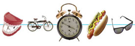
Observe a group of people in a room. You can often learn a lot about who is listening intently to another person, which are strangers, or who is ignoring who by how close together they sit or stand. In design, proximity or closeness creates a bond between people and between elements on a page. How close together or far apart elements are placed suggests a relationship (or lack of) between otherwise disparate parts. Unity is also achieved by using a third element to connect distant parts.
Design basicsthe proximity principle
Artikel aus: www.macworld.com - by Lesa Snider
Good design isnt rocket science, but it sure can feel like it. Even though you may never have driven past an art schoolmuch less gone to a classyou can create layouts that are visually pleasing, eye-catching, and easy to read. If you can memorize four easy principles, youve got what it takes to create a good, solid design for any of your compositions. Here, I will outline one of those design principles and help you put it into practice by using a newspaper ad as an example.
Now, these aren't my personal secrets; theyre from Robin Williams' book, The Non-Designer's Design Book (Peachpit Press). I purchased this book when I went back to art school years ago, and I still refer to it today. Lets get started with the first rule, which involves the importance of proper spacing.
Proximityspace matters
One of the easiest ways to create a visual structure and give your piece an organized feel is to space items according to their relation to one another. This is called the rule of proximity, and it simply means that related items should appear closer together than items that are not related. In this way, the spacing itself serves as a visual clue as to whats related and whats not and as to where one piece of information stops and starts. Plus, it makes the piece a hundred times easier to scan and digest.
Sure, you could sprinkle some blank returns into your layout, but a full return is usually too much (or too little) space. A better idea is to use the Space Before and Space After functions built into most software. These controls let you add a very specific amount of spaceusually in pointsexactly where you want it. Simply place your cursor within the line you want to affect (no need to highlight the text) and locate the Space Before and Space After paragraph attributes in the software youre using. Heres where it lives in some popular programs (see Image 1 below):
- Microsoft Word, Tex-Edit Plus: In the Format menu (choose Format -> Paragraph)
- Apple Pages, Keynote: In the Text Inspector (choose View -> Show Inspector and click the big T)
- Adobe Photoshop: In the Paragraph panel (choose Window -> Paragraph)
- Adobe InDesign, Illustrator: In the Control panel when the paragraph icon is active (choose Window -> Control and click the Paragraph icon)
- QuarkXPress: In the Measurements palette when the paragraph icon is active
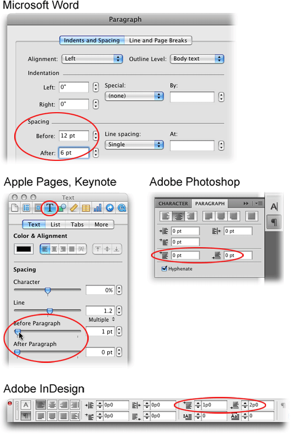
The Space Before and Space After settings exist as paragraph attributes in most software.
Image 2 Before
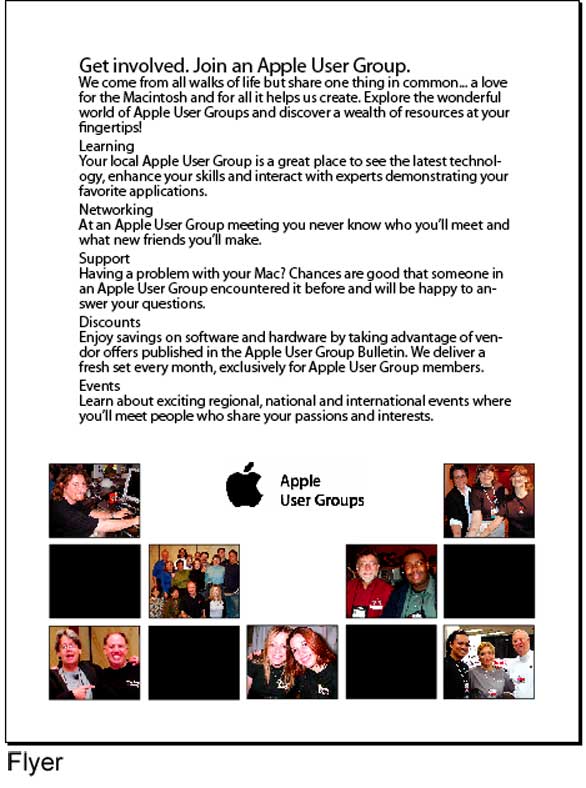
Image 2 After
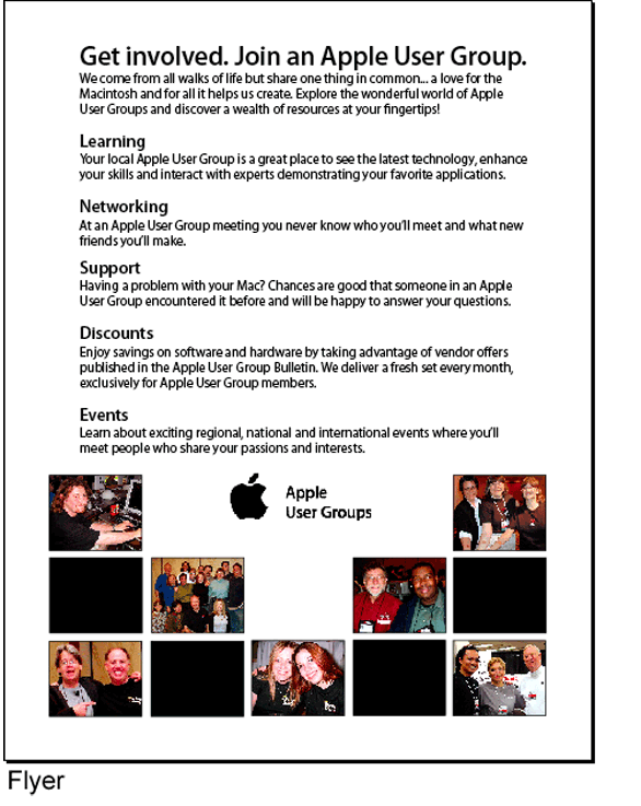
Image 3 Before
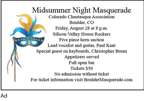
Image 3 After
Design Principles - Proximity
Artikel aus: www.nhsdesigns.com
Items relating to each other should be grouped close together. When several items are in close proximity to each other, they become one visual unit rather than several separate units. This helps organize information, reduces clutter, and gives the reader a clear structure.
Very often in the work of new designers, the words and phrases and graphics are strung out all over the place, filling comers and taking up lots of room so there won't be any empty space. There seems to be a fear of empty space.
When pieces of a design are scattered all over, the page appears unorganized and the information may not be instantly accessible to the reader.
The Principle of Proximity states that you group related items together, move them physically close to each other so the related items are seen as one cohesive group rather than a bunch of unrelated bits.
Items or groups of information that are not related to each other should not be in close proximity (nearness) to the other elements, which gives the reader an instant visual clue to the organization and content of the page.
A very simple example illustrates this concept.
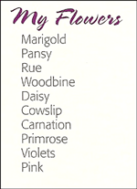
In the list above, what do you assume about all those flowers? Probably that they have something in common, right?
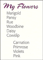
In the list above, what do you assume? It appears that the last four flowers are somehow different from the others. You understand this instantly. And you understand it without even being conscious of it. You know the last four flowers are somehow different because they are physically separated from the rest of the list.
That's the concept of proximity-on a page (as in life), physical closeness implies a relationship.
Business Card
Take a look at this typical business card layout, below. How many separate elements do you see in that small space? That is, how many times does your eye stop to look at something?
xxx
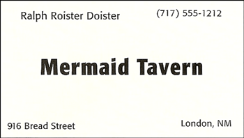
- Does your eye stop five times? Of course - there are five separate items on this little card.
- Where do you begin reading? In the middle, probably, because that phrase is boldest.
- What do you read next-left to right (because it's in English)?
- What happens when you get to the bottom-right corner? Where does your eye go?
- Do you wander around making sure you didn't miss any corners?
And what if I confuse the issue even further:

- Now that there are two bold phrases, where do you begin?
- Do you start in the upper left? Do you start in the center?
- After you read those two items, where do you go? Perhaps you bounce back and forth between the wards in bold, nervously trying to also catch the words in the corners.
- Do you know when you're finished?
- Does your friend follow the same pattern you did?
When several items are in close proximity to each other, they become one visual unit rather than several separate units. As in life, the proximity, or the closeness, implies a relationship.
By grouping similar elements into one unit, several things instantly happen: The page becomes more organized. You understand where to begin reading the message, and you know when you are finished. And the "white space" (the space around the letters) automatically becomes more organized as well.
A problem with the previous card is that not one of the items on the card seems related to any other item. It is not clear where you should begin reading the card, and it is not clear when you are finished.
If I do one thing to this business card - if I group related elements together, into closer proximity - see what happens:

- Now is there any question about where you begin to read the card?
- Where do your eyes go next?
- Do you know when you're finished?
With that one simple concept, this card is now organized both intellectually and visually. And thus it communicates more clearly.
Let's compare all three side-by-side:

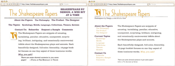
Newsletter Masthead
Shown below is a typical newsletter flag masthead. How many separate elements are in this piece? Does any item of information seem related to any other, judging from the placement?

- Take a moment to decide which items should be grouped into closer proximity and which should be separated.
- The two items on the top left are in close proximity to each other, implying a relationship. But should these two have a relationship? Is it the Society that's amusing and peculiar, or "The Shakespeare Papers"?
- How about the volume number and date? They should be close together since they both identify this particular issue.
In the example below, the proper relationships have been established.

Notice I did a couple of other things along the way:
- I changed everything from all caps to lowercase with appropriate capitals, which gave me room to make the title bigger and stronger.
- I changed the corners from rounded to straight, giving the piece a cleaner, stronger look.
- I enlarged the swan and overlapped the edge with it. Don't be a wimp.
Flyer
When you create a flyer, a brochure, a newsletter, or whatever, you already know which pieces of information are logically connected, you know which information should be emphasized and what can be de-emphasized. Express that information graphically by grouping it.

Obviously, this list needs some formatting to make it understandable. But the biggest problem with this list is that everything is close to everything else, so there is no way to see the relationships or the organization.

The same list has been visually separated into groups. I'm sure you already do this automatically - I'm just suggesting that you now do it consciously and thus with more strength. Notice I added same contrast to the headlines and repeated that contrast.
Schedule
Sometimes when grouping items into close proximity, you need to make some changes, such as in the size or darkness or placement of text or graphics.
Body copy (the main bulk of reading text) does not have to be 12 point! Information that is secondary to the main message, such as the volume number and year of a newsletter, can often be as small as 7 or 8 point.
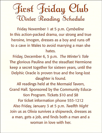
- Not only is this page visually boring (nothing pulls your eyes in to the body copy to take a look), but it is difficult to find the information - exactly what is going on, where is it happening, what time is it at, etc. It doesn't help that the information is presented inconsistently.
- For instance, how many readings are in the series?
The idea of proximity doesn't mean that everything is closer together; it means elements that are intellectually connected, those that have some sort of communication relationship, should also be visually connected. Other separate elements or groups of elements should not be in close proximity.
The closeness or lack of closeness indicates the relationship.
- How many readings are in the series?
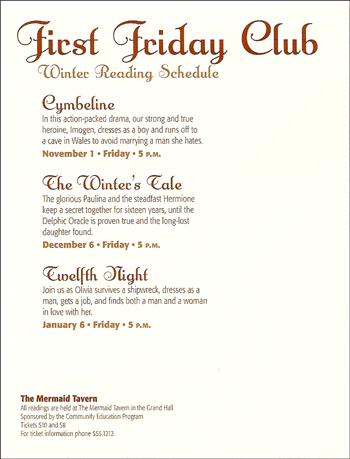
- First I intellectually grouped the information together (in my head or sketched onto paper), then physically set the text in groups on the page.
- Notice the spacing between the three readings is the same, indicating that these three groups are somehow related.
- The subsidiary information is farther away - you instantly know it is not one of the readings, even if you can't see it clearly.
Below you see a similar example to the one on the previous page. Glance at it quickly - now what do you assume about the three readings?
And why exactly do you assume one reading is different from the others? Because one is separate from the others. You instantly know that event is somehow different because of the spatial relationships.
It's really amazing how much information we get from a quick glance at a page. Thus It becomes your responsibility to make sure the reader gets the correct information.
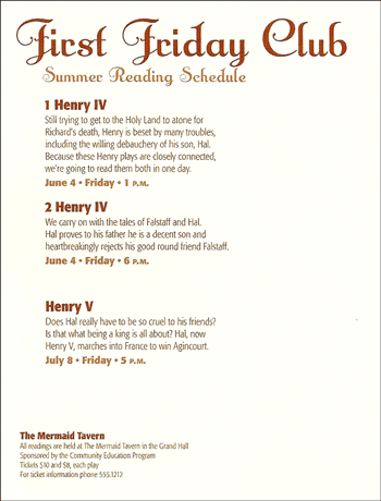
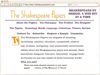
Postcard
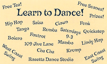
The designer's intention with this dance postcard was probably to create something fun and energetic, but at first glance, can you tell when and where the classes are happening?
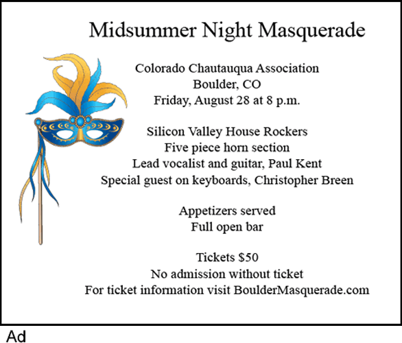
By using the principle of proximity to organize the information (as shown below), we can communicate immediately who, what, when, and where. We don't run the risk of losing potential customers because they give up searching through the vast field of slanted text.

Don't feel like you have to somehow portray "dancing" (in this case) through your design. At this point, if your choice is between clear communication or amateur design, choose clear communication. Upgrading your design skills is a gradual process and begins with clear communication.
Mini-Poster
You're probably already using the principle of proximity in your school work, but you may not be pushing it as far as you could to make it truly effective. Really look at those pages, at those elements, and see which items should be grouped together.

The person who designed this mini-poster typed two Returns after each headline and paragraph. Thus the headlines are each the same distance from the body copy above and below, making the heads and body copy pieces appear as separate, unconnected items. You can't tell if the headline belongs to the text above it or below it because the distances are the same.
There is lots of white space available here, but it's all broken up. And there is white space where it doesn't belong, like between the headlines and their related texts. When white space is "trapped" like this, it tends to visually push the elements apart.
Group the items that have relationships. If there are areas on the page where the organization is not perfectly clear, see if items are in proximity that shouldn't be. Use the simple design feature of space to make the page not only more organized, but nicer to look at.

If I do just one thing to this piece, if I move the headlines closer to their related paragraphs of text, several things happen:
- The organization is clearer.
- The white space is not trapped within elements.
- There appears to be more room on the page.
I also put the phone and email address on separate lines - but grouped together and separated - so they'll stand out as important information.
And you probably noticed that I changed the centered alignment to flush left (that's the principle of alignment, as explained in the next section), which created more room so I could enlarge the graphic.
Menu
Proximity is really just a matter of being a little more conscious of doing what you do naturally, but pushing the concept a little further. Once you become aware of the importance of the relationships between lines of type, you will start noticing its effect. Once you start noticing the effect, you own it, you have power over it, you are in control.

Lest you think no menu could be this bad, know that I took it right out of a restaurant. Really. The biggest problem, of course, is that all the information is one big chunk.
Before trying to design with this information, write out the separate pieces of information that belong together; group the elements. You know how to do this - simply use your brain.
Once you have the groups of information, you can play with them on the page. Later we will learn how to format a page in computer software.
In the example below, I put more space between the separate menu items. One should almost never use all caps because they are so hard to read, so I changed it to caps and lowercase. And I made the type a couple of point sizes smaller, both of which gave me a lot more room to work with so I could put more space between the elements.

The biggest problem with the original menu is that there is no separation of information. In your software, learn how to format so you can make exactly the amount of space you need before and after each element.
The original text in all caps took up all the space so there was no extra, blank, "white" space to rest your eyes. The more text you have, the less you can get away with all caps. And it's okay to set the type smaller than 12 point! Really!
In the previous example, we still have a little bit of a problem separating the "Starters" and the "Entrees". Let's indent each section - watch how the extra space defines these two groups even further, yet clearly communicates that they are still similar groups. (I enlarged the size of "Starters" and "Entrees" also, which is the principle of Contrast.)
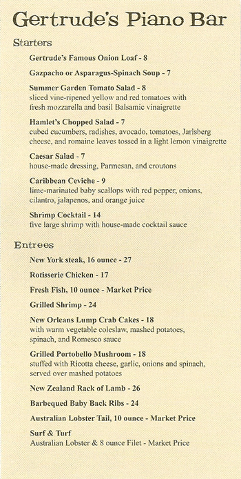
We really don't have enough room to add more space before "Starters" and "Entrees", but we do have room to make an indent. That extra space under the heading helps to separate these two groups of information. It's all about space.
Rarely is the principle of proximity the only answer to a page. The other three principles are intrinsic to the design process and you will usually find yourself using all four. But take them one at a time-start with proximity.
In the example below, you can imagine how all of the other principles would mean nothing if I didn't first apply the appropriate spacing.
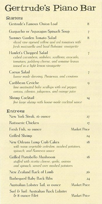
I chose a more interesting typeface than Times New Roman - that's easy to do. I experimented with indenting the descriptions of the menu items, which helped to clarify each item a little further.
It bothered me that the prices of the items were tucked into the text (with dorky hyphens), so I aligned them all out on the right where they are easily visible and consistently arranged. That's the principle of alignment, which is coming right up the next section.
Here are the examples again, side-by-side for comparison:

Web Page
The simple principle of proximity can make web pages easier to navigate by collecting information into logical groups. Check any web site that you feel is easy to get around in - you'll find information grouped into logical clumps.
- The information on this page is muddled.
- Look at the site links just under the title. Are they all equal in importance? In the arrangement above, they appear to be equal in importance - but realistically they're not.
I have to repeat myself: Intellectually, you already know how to use proximity. You already know how to collect pieces of information into their appropriate groups. All you need to do is transfer that skill to the printed page. Use space to define groups of elements.

- I moved all the site links into one column to show their relationships to one another.
- I set the quotation farther away from the main body copy since it's not directly related.
- I also used the principle of alignment: I used flush-left alignment and made sure each element lined up with something else.
Here are the two examples again, side-by-side for comparison:
Summary of Proximity
When several items are in close proximity to each other, they become one visual unit rather than several separate units. Items relating to each other should be grouped together. Be conscious ofwhere your eye is going:
- Where do you start looking?
- What path do you follow?
- Where do you end up?
- After you've read it, where does your eye go next?
You should be able to follow a logical progression through the piece, from a definite beginning to a definite end.
The basic purpose
The basic purpose of proximity is to organize.
Other principles come into play as well, but simply grouping related elements together into closer proximity automatically creates organization. If the information is organized, it is more likely to be read and more likely to be remembered.
As a by-product of organizing the communication, you also create more appealing (more organized) white space (designers' favorite thing).
How to get it
- Squint your eyes slightly and count the number of visual elements on the page by counting the number of times your eye stops.
- If there are more than three to five items on the page (of course it depends on the piece), see which of the separate elements can be grouped together into closer proximity to become one visual unit.
What to avoid
- Don't stick things in the corners or in the middle just because the space is empty.
- Avoid too many separate elements on a page.
- Avoid leaving equal amounts of white space between elements unless each group is part of a subset.
- Avoid even a split second of confusion over whether a headline, subhead, caption, graphic, etc., belongs with its related material. Create a relationship among elements with close proximity.
- Don't create relationships with elements that don't belong together! If they are not related, move them apart from each other.
Proximity: How To Effectively Organize Your Pages
xxx guter Artikel aus: www.webdesign.org
Designing a website without intentional and effective white (or blank) space is like throwing your dinner into the blender and then drinking it through a straw. Pretty unappetizing.
Otherwise-good food is ruined because you're not able to appreciate each taste and texture. In the same way, it's impossible to enjoy a website where all the content is mixed up and you can't digest individual elements.
That's where the principle of proximity comes in. It states:
Elements that are related should be visually connected. Likewise, elements that are not related should be visually separated.
It's basically the same concept as the use of paragraphs in an article. When I begin a new paragraph, you can tell by the physical separation that I am starting a new thought. By the same token, the closeness in proximity means each sentence in the paragraph should relate to the others in that same paragraph.
So how do you make effective use of proximity? Here are the dos and don'ts:
- DO use white space to separate things that aren't related. When you're laying out a web page, put everything into groups (for example, navigation, copy, contact/copyright info, news items, ads, special focus sections, etc.). After you've grouped everything, make sure the groups are adequately separated from each other.
- DON'T use white space to break up items that belong together. For example, don't put space between your heading and the first line of your copy. Don't put space between a picture and its caption, or between a product description and the order button. Closeness in proximity should be used to help the eye recognize when certain things should be understood together.
Instead of separating related items, put white space AROUND these groupings. This will emphasize the fact that the information contained in the framed area goes together. - DON'T feel obligated to fill every nook and cranny of your site. Having some empty space is a good thing, because it gives your site breathing room. Focus on an open, airy layout. Again, empty space between elements helps your eye focus more easily on the groups.
- DON'T confuse white space with dead space. White space is intentional; dead space is not. Dead space is merely empty pockets of space without a purpose. If your site is filled with dead space, no relationships will be emphasized, and it won't be visually obvious what items should be understood together. This makes your page look cluttered.
Work hard to make sure you're actually using space (or lack of it) to emphasize which elements go together and which do not. - DO use white space to create a dramatic effect. The eye is drawn to isolated objects. The more isolated an object is, the more pull power it has on your eyes. So if you want a big effect, use a lot of space.
- Step back, take a look at your site, and make sure you've used space to effectively organize your site. Check specifically to ensure there's breathing room. Remember the principle of proximity:
Elements that are related should be visually connected. Elements that are not related should be visually separated.
Gesetz der Nähe
Artikel aus: www.gestaltpsychologie.net
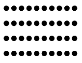
Beim Gestaltgesetz der Nähe werden Elemente, die geringe Abstände zueinander haben, als zusammengehörig wahrgenommen.
In dem Beispiel rechts kann man dies gut erkennen. Die jeweils näheren Linien werden so wahrgenommen, dass Sie jeweils ein Paar bilden.
Nähe
Artikel aus: www.braekling.de
Weiter geht es mit dieser Reihe zu den Gestaltgesetzen. Nachdem sich der erste Teil mit dem Gesetz der Prägnanz beschäftigt hat, soll dieser Artikel das sogenannte Gesetz der Nähe genauer beleuchten.
Eigentlich ist es eine ganz einfache Regel: Wir gruppieren einzelne Elemente des von uns Gesehenen, sobald diese eine gewisse Nähe zueinander haben. Das bedeutet, dass wir nah beieinanderstehende Elemente als zusammengehörig wahrnehmen.
Ganz gut sichtbar wird dieses Phänomen, wenn wir uns das obige Bild einmal genauer ansehen. Kaum jemand käme auf die Idee, dieses Bild zu beschreiben, indem er z.B. sagt Eine Linie, noch eine Linie, größerer Abstand, noch eine Linie und noch eine Linie oder Vier Linien mit verschiedenen Abständen. Vielmehr hören wir Beschreibungen der Art zwei Linienpaare o.ä.
Natürlich stellt sich auch hier wieder die Frage, wozu eine solche Erkenntnis gut sein könnte: Das Gesetz der Nähe kann wunderbar bei der Gestaltung von Programmoberflächen eingesetzt werden. Ein typisches Beispiel ist die Anordnung von Buttons in einer Toolbar. Statt einfach alle Buttons nebeneinander aufzureihen, kann man thematisch zusammengehörige Buttons direkt beieinander darstellen und zu den Buttons eines anderen Themas einen kleinen Abstand einfügen (z.B. Buttons für Dateioperationen und Buttons für Schriftformatierung).

Aber auch ein Formular kann durch geschickte Gruppierungen nach dem Gesetz der Nähe deutlich leichter interpretiert werden. Die nebenstehende Abbildung zeigt einen Frühstückskonfigurator in zwei unterschiedlichen Ausführungen. Variante 1 verzichtet auf Nähegruppierungen, wodurch alle Radiobuttons gleichwertig wirken. Problematisch ist jedoch, dass offenbar zwei Radiobuttons auswählbar sind was (so wissen wir aus Erfahrung im Umgang mit solchen Schaltflächen) nicht möglich sein dürfte. Erst durch solche Überlegungen und genaueres Betrachten des Formulars erschließt sich, dass es sich um zwei verschiedene Gruppen von Radiobuttons (Belag & Brot) handelt, die getrennt voneinander bedient werden.
Eine deutlich bessere (wenn alleinstehend auch nicht immer perfekte) Lösung bietet hingegen Variante 2. Da die einzelnen Radiobuttons einer Gruppe durch die Nähe untereinander bzw. durch die Distanz zu den Buttons der jeweils anderen Gruppe klar zugeordnet werden können, fällt die Anwendung des Frühstückskonfigurators deutlich leichter. Die bei Variante 1 notwendigen Überlegungen zur eigenen Zerlegung in Gruppen ist somit überflüssig und der Nutzer kann mit deutlich geringerem kognitiven Aufwand sein Frühstück zusammenstellen.
Gesetz der Nähe
Artikel aus: iug.upb.de

Gesetz der Nähe
Es schließen sich die Teile zu einer Gruppe zusammen, die räumlich benachbart sind.
Bei ungleichem Abstand von Teilgebilden tritt das Gesetz der Nähe in Kraft, nach welchem räumlich benachbarte Elemente zu Gruppen zusammengefasst werden (vgl. [Ka69:33]). Es wird jedoch erst dann wirksam, wenn aus einem größeren Gebilde kleinere Gruppen herausgenommen werden können und sich aufgrund der verringerten Entfernung eine Gruppierung ergibt (vgl. [Koe71:42]). Die Wirkung dieses Gesetzes ist im Übrigen stark abhängig von der Dichte der Elemente innerhalb der Teilgruppen [Me66:701].
Für die Bildschirmgestaltung ist das Gesetz der Nähe von höchster Priorität, da durch dessen Anwendung logisch zusammengehörende Informationen durch Absätze, Zwischenräume, Spalten- bzw. Tabellenbildung oder Einrücken optisch zu Informationsblöcken zusammengefasst werden.
Das Gesetz der Nähe: "Zeilen oder Spalten"

PROXIMITY
xxx guter Artikel aus: daphne.palomar.edu
PROXIMITY
Proximity is concerned with where items are placed.
Where items are placed in relation to each other is another important gestalt consideration. Proximity relationships will generally dominate over similarity relationships. The strongest control is available when the two are used together. There are four specific types of proximity relationships that will be studied in this lesson: close edge, touch, overlap and combining.
Close edge: The general concept for proximity states that the closer items are to one another, the more likely they are to be seen as a group. The amount of space involved is relative.
Look at the example above and notice that there are fourteen items that form three groups with one orphan at the bottom right that is not quite part of the group above it. Size is another strong grouping option. Shape is a distant third for forming groups.

This sign for a money exchange makes poor uses of close edge proximity.
The $ sign is too close to the word exchange. Makes you think twice about using their services.
This kind of grouping is used extensively with printed type. The example below forms two words -- close and edge. You know it is two words because of the larger space between them.

In the example below the same space that was between words in the example above is used between the letters of close and edge. Notice that they still form two words because of the even larger space between them.

We read words from left to right but also from top to bottom. Close edge relationships can form groups in any direction. What would you order if you saw this sign in a restaurant window?

In the example below the letters and the colored backgrounds are in a close edge relationship. The white paper shapes the letters were printed on are not a factor against a white background.

Touch: When items get close enough they touch. They still are two different items but they seem to be attached together. This makes for a stronger gestalt than close edge. Notice in the example to the left that the touching groupings are stronger than the close edge groupings. In the example there are no size differences so the shape relationships are more noticeable.
In the example below the letters and/or their colored backgrounds touch.
Overlap: The strongest gestalt between two items happens when they overlap. Two colors are used in the example to the left to show the overlaps better. When the two items are the same color they seem to form a new, more complex shape. The new shape seems flat.
When the items are different colors the overlap produces the illusion of a shallow space. The overlapped items form a strong group regardless of color.
Notice the grouping hierarchy. The overlapped groups are the strongest. The two color groups are a close second to the all black group. Touching is next then close edge. Shape is probably the weakest gestalt in this example.
In the example below the letters and/or their diferent colored backgrounds all overlap.

All of the above examples of proximity relationships have used simple shapes that are grouped because of where they are placed in relationship to each other. No additional elements are used.
Combine: It is possible to group various items together by using an external element that acts to combine the items regardless of what other gestalt concepts are being used. The underline used in the previous sentence is such a combining device. Notice that it groups the phrase "external element" and sets it off from the rest of the sentence.

A significant characteristic of combining is that it both groups the items used and sets them apart from the rest of the information around them. This "highlighting" (another combining device) is perhaps the most significant aspect of this concept. It is used with information that the designer wants to call attention to. The quotation marks and brackets in this paragraph serve the same purpose.
There are many ways to combine items. Underlining items, putting boxes around them and putting items against a background (such as a color or a picture) are the most common.
In the example to the left all of the proximity and similarity concepts are used. Note how the items combined by the red and black squares are grouped both with each other and with the background squares. Also note that these are the items that stand out the most.
In the example below the letters are all combined on the green background.

SIMILARITY/PROXIMITY COLLAGE
Make a collage that consists of a simple phrase of four or more words and a picture that illustrates the phrase. The words will be made using all different sizes, colors and shapes of letters cut from magazines. The letters will be chosen for maximum variety and no duplicate styles are allowed unless there are more than twenty letters in the phrase. There will be at least one word using each of the four proximity techniques to organize all of that word's letters into the word. All of the letters must be easy to see and the phrase must be easy to read.
HOW TO START
Find a phrase that you are interested in using that can be illustrated with a picture you can find (or make). Use a song title, song lyrics, a bit of a poem, a quotation, a proverb or common phrase that you can relate to. There has to be at least four words with two or more letters. Do not go overboard. This is time consuming and can take up a lot of space.
Start collecting letters. Tear whole pages or sections of pages out of magazines that contain large, colorful, interesting letters. After you have a twenty or more groups of letters collected start spelling out your phrase. One technique is to write the phrase out on a large page with lots of space around each letter. Cut or tear out the letters you want to use and put them in piles on the corresponding letters of your phrase.
Remember that the color of paper behind the letter will often show so make the shapes around the letters look like what you want to see.
As you are looking for letters, look for an illustration to use. Be open minded and flexible. Sometimes a picture will suggest a phrase and you can start with the illustration.
Do not trim anything too close until you see where it is going and how it will be effected by the imagery around it.
When you have all the parts start laying out the composition. Try lots of different variations until you have what you want. Use combining on the most important part of the phrase. You can combine a single word for emphasis or a part of the phrase to set it off.
Make sure you have used all four proximity techniques, each for an entire word. Touch and overlap work best on short words. The colors behind the letters can be the things that touch or overlap.
Make sure it is readable and all of the letters are easy to see.

ADDITIONAL GESTALT OPTIONS
The white paper in the Design Book will not act to unify the composition the same way a colored background will. A colored background will act as a combining device for the entire composition -- especially important if more than one page is used. A border will do the same thing. Choose a color that will work well with the rest of the image.
Combine one or more significant words on top of the illustration. This will set those words off and relate them to the picture. Be careful with the backgrounds of the letters and where they are placed on the picture. The potential for visual confusion is great and extra care must be taken to make the word(s) readable.
Similarity can be used to spotlight certain words. Make a word like "fire" all reds for instance. Use different sizes and shapes to control variety.
Choose an especially large, visible letter for the first letter in the phrase. This composition is probably going to look very confusing and it is a good idea to help the viewer find a place to start looking.
PRESENTATION If the composition will fit on one page make sure there is room for the label. If not, put the label on the facing page. The image can use either a vertical or horizontal format. If more space is needed a fold out is recommended. To do this: Take a page out of the back of the book and trim off the rough edge where the spiral binding went. Carefully fold 1/2 inch along the edge you want to join to the page in your book. Put glue on the folded edge and glue the new page addition onto the page in the book that you are going to mount your project on. The new addition can be trimmed if less than a full page is required. It is possible to make a project that is 2, 3, 4 or more times as large as your design book page. The problems start when you glue the collage onto the new page. Try to avoid putting anything over the crease. The flexing of the paper will make the glue fail unless you are very careful.
ALIGNMENT
Artikel aus: daphne.palomar.edu
A variation of proximity that is very often used in graphics is alignment. This concept works when visual elements align along edges or vertically through their centers.
Alignment is an extension of proximity. It has to do with placing items so that they line up. Alignment is a concept that produces both grouping and organizes information to create order.
In this lesson you will:
- Learn the two basic types of alignment
- Explore some of the more subtle alignment techniques.
ALIGNMENT
The root word for alignment is "line"-- to line up.
Alignment is one of those obvious design concepts that hardly seem worth making a big deal about. It is something you see and use every day. There are, however, many more opportunities to use this system for organizing materials than are obvious without a thorough understanding of the principles involved.
Items can line up either along their edges or on their centers. Alignment is used extensively to organize all graphic arts. Almost all text uses alignment to organize lines of type. The letters align along their bases and the lines begin (and/or end) along a line. You probably discovered the importance of this in the last project.
Graphic art refers to art that is printed.
Alignment works best with items that have straight edges, especially rectangles. Rectangles are the most economical shapes to trim pictures into so pictures are most often seen in that format. Text is made of letters of varying shapes that form lines and blocks that act as rectangles. Most formats are also rectangles.
There are two major types of alignment: edge and center.
EDGE ALIGNMENT
Any object with flat edge(s) can be used for edge alignment. Rectangles are especially well suited for this since they have four flat edges to align. Their right angels also give a sense of order to a composition using them (similarity).
Note in the example below how it is possible to align one or more edges of a rectangle. When more edges are aligned the rectangle seems to be in a stronger gestalt with the surrounding shapes. Also note how the distance between shapes is a factor in how strong the gestalt seems. The repetition of right angles adds a similarity gestalt to the composition, which increases the sense of unity.
It is possible to set up other angles of alignment with shapes other than rectangles. The critical factor is that the objects do align along their edge(s) in a way that is clear. Objects that are on opposite sides of a composition may align but it is unlikely that the alignment will be noticed.
An obvious kind of edge alignment takes place around the outside of a group of shapes when they align to provide a simple overall shape (format) -- especially when that shape is a rectangle.
Can you see where alignments are used in the interior of the example above?
CENTER ALIGNMENT
Any shaped items can be organized using center alignment. Simple shapes work best because it is easier to judge their centers so the alignment is easier to notice.
Center alignment will work to some extent on any axis but it works best with a vertical axis (see the example to the left). This is because the vertical axis relates best to our sense of balance and symmetry (see symmetrical balance).
Objects that are not rectangles should be center aligned on a vertical axis or enclosed in a rectangular background and edge aligned. With diagonals you just take your chances.
As you are looking through magazines for materials to use for this project take time to notice that almost every item on every page is organized using either edge or vertical center alignment.
FINE POINTS
There are a number of subtle variations on alignment that can add to the effectiveness of this concept. The outside edges of pictures usually show up well and make for obvious alignments. The edges of information within a picture can also align with other edges in a composition. This technique can add subtle touches to a composition.

Notice how the back of the cat aligns with the top of the buildings.
Place information where you think it will look best then look for ways you can achieve alignments with a minimal amount of moving and/or trimming. You need to look carefully for opportunities to use alignment since they will help create order.
Centering in a negative space is a kind of alignment. This works best when there is some other alignment to back up the centering. One positive side effect of this technique is that there is a uniform space around the centered item. Narrow strips of background between pictures and text blocks are called gutters. If they are used throughout a composition they look like lines that go around the information in the design and help achieve unity. When a colored background is used the gutters become colored lines.
Gutters are used in graphic images to separate type and pictures from one another. They also provide a repetitious visual element that can create a rhythm in the composition.
In the above example the centered items are marked with dashed blue lines. Note the white gutters that run throughout the composition.
Inserts are words or images that overlap other images. They can partially overlap or be completely inside. They make a compact package of two or more sets of information and can conserve space or hide unwanted areas in an image. An insert will show up best if there is a contrasting border around the inset. Text can be inserted effectively if it has a background that allows all of the information to be seen.
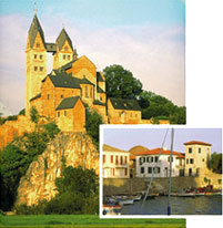
This partial insert has a white border to make the edge of the inserted picture easier to see.

The smaller pictures is completely inserted. There is enough contrast that no border is necessary.
In the examples above there are only subtle alignments for the inserts. In the first example the right side of the background picture aligns with the left edge of the tower in the insert. In the second example the bottom of the boat picture aligns with the line under the clock on Big Ben. See how many other alignments you can find.
Das Gesetz der Nähe:
Artikel aus: www.informatik.uni-bremen.de
Elemente mit geringen Abständen zueinander werden als zusammengehörig wahrgenommen
Nähe
Artikel aus: weblab.uni-lueneburg.de
Nähe
Die Elemente mit dem geringsten Abstand voneinander werden zu Gruppen zusammengefasst.

Nähe
Artikel aus: www.e-teaching.org
Nah beieinander liegende Elemente werden als Einheit wahrgenommen. In Lernanwendungen kann das Gesetz der Nähe genutzt werden, um strukturelle Zusammenhänge abzubilden und damit die Informationsdichte zu reduzieren. Zusammengehörende Objekte sollten auch möglichst eng beieinander stehen. Dies gilt insbesondere bei Grafiken und Beschriftungen. Eine Beschriftung sollte möglichst nahe an dem Detail stehen, das es erläutert. Eine Beschriftung innerhalb einer Grafik ist daher oft einer Legende vorzuziehen. Eine Trennung von zueinandergehörenden Texten und Bildern, insbesondere über mehrere Bildschirmseiten hinweg, gilt es generell zu vermeiden.
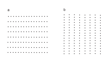
Aufgrund des Gesetz der Nähe gruppieren wir in Bild a die Punkte zu Zeilen und in Bild b zu Reihen.
Law of Proximity
Artikel aus: psychology.about.com
According to the law of proximity, things that are near each other seem to be grouped together.

Gestalt Principles of Perception - 3: Proximity, Uniform Connectedness, and Good Continuation
xxx guter Artikel aus: xxx
The reason that what youre reading right now makes sense to you, other than the fact that you are familiar with the written English language, is due largely to the fact that Im employingand you perceivethree important Gestalt Principles. The structure of this paragraph is dependent on its adherence to and consistency with the principles of proximity, uniform connectedness, and good continuation. Without these three factors I would be unable to clearly communicate my thoughts to you through this medium (written/typed words) and what you are seeing would bear little or no relationship to language.
The paragraph is not an arbitrary construct nor was it an optional invention. It is required for written communication; else communicative writing would be relegated to individual words or unwieldy, enormous chunks of copy. For example, the image below shows the first paragraph of this article as it might appear without any reference to the aforementioned Gestalt Principles:
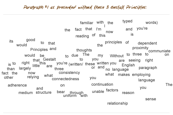
I expect that it would have been difficult or impossible for you to discern my thoughts if I had used this format, having dispensed with the principles of proximity, uniform connectedness, and good continuation.
We employ and rely upon these three principles in most aspects of our lives, with both physically tangible and conceptual components of our experience. In fact we would literally be lost without doing so. Though we all possess an intuitive perception and reliance on them, it is good for a designer to have a granular and working understanding of all three of these principles
Proximity
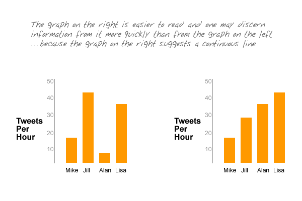
It does not get any simpler than this, folks: things that are close to one another are perceived to be more related than things that are spaced farther apart. As this principle does not rely on any extraneous structure, it is among the first principles to impact our perception and from which we derive understanding. All of us intuitively understand that the simplest way to indicate relatedness is to manipulate proximity. What we might not intuitively understand, however, is how powerful the principle of proximity is.
In the example below, proximity clearly indicates relatedness and relative association:
In the next example however, another Gestalt Principle is added to the mix (similarity), but our perception of proximity overpowers it. We might otherwise associate these elements according to the two distinct colors, but proximity wins the day.
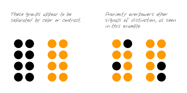
Fundamental mechanisms of our perception are almost always competing with one another, as exemplified in the image above. As a designer, it is important that you understand the relative strengths of these mechanisms so that you can choose which one to exploit in a given situation. There is only one principle of perception that is more powerful than proximity and we get to that one next.
Uniform Connectedness
The principle of uniform connectedness is the strongest of the Gestalt Principles concerned with relatedness. It refers to the fact that elements that are connected by uniform visual properties are perceived as being more related than elements that are not connected. As with the principle of proximity, uniform connectedness causes us to perceive groups or chunks rather than unrelated, individual things.
In practice, uniform connectedness is quite simple: draw a box around a group of elements and youve indicated that theyre related. Alternately, you can draw connecting lines (or arrows or some other tangible connecting reference) from one element to the next for the same effect. For instance:
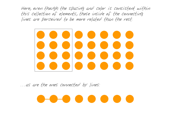
Heres an example (below) of how uniform connectedness can be useful in organizing a complex interface:
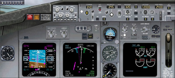
Okay, this is a terrible interface, but it is better than it might otherwise be. In this example (above), one would find the dashboard of a 747 airliner far more confusing if not for the clear context provided by the boxed groupings. The borders around certain groups of controls indicate their contextual relatedness, making function and purpose easier to perceiveas a small number of chunks rather than a large number of individual elements.
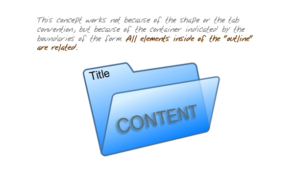
In web design, it is common to employ uniform connectedness to show context. Tabbed navigation is a prime example of this principle. When you have two visually and proximally distinct elements (navigation link and page copy), the easiest way to show related context is to enclose disparate elements, like this:
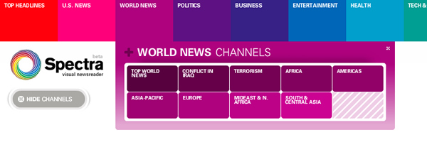
One might think that tabbed navigation is most effective because of our familiarity with the physical and conceptual idea of a filing folder, but the fact is more basic. The filing folder works because of the principle of uniform connectedness, not the other way around.
Heres an example showing the efficacy of connecting lines and the problems encountered when theyre not used:

This image (above ) just doesnt make much sense. Whats missing is the essential element that exploits uniform connectedness. Lets fix that:
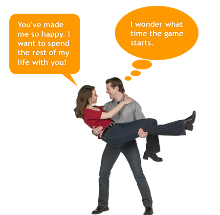
Here (above) we have clear context and have associated the woman with what we now perceive as something she is saying. The speech bubble works not because of graphic or cultural convention, but because of how it is consistent with uniform connectedness. You might notice, however, that while the speech bubble uses an arrow/line to connect the woman to her speech, the mans thought bubble is doing something different. The thought bubble still works, but for a different reason and because of a different principle, which well examine next.
Good Continuation
At the start of this article, I made reference to the fact that the paragraph works to accurately and efficiently communicate my thoughts because of proximity, uniform connectedness, and one other Gestalt Principle. The final principle employed here is good continuation, which references the fact that elements arranged on a line or curve are perceived to be more related than elements not on the line or curve. This principle can be clearly perceived in the image above, where the man and the thought bubble are connected by the gently curved arrangement of the smaller bubbles between them (which work like breadcrumbs).
The fact that the words within this paragraph are on a straight line (or series of lines) helps us to understand that theyre related to one another (and is supported by the fact that the words are grouped together with proximity and the white space around the paragraph depicts a box). Clearly, the linear arrangement of the words is a powerful mechanism, as exemplified by the fact that all written language employs the standard principle of good continuation, if not all in the same direction or orientation.
The principle of good continuation advises us on effective ways to indicate relatedness, but not just with words in a paragraph or breadcrumbs toward a thought bubble. Good continuation is especially useful for allowing us to penetrate and understand meaning as indicated by all sorts of visual structures. For example:
In each of the images above, the components displayed have a clear indication of their relatedness because of how they describe a straight line or are positioned on a continuous curve (and information not on the curve is not as associated as those bits on the curve!). It is therefore easy to suggest or perceive a context that is described by the respective groupings.
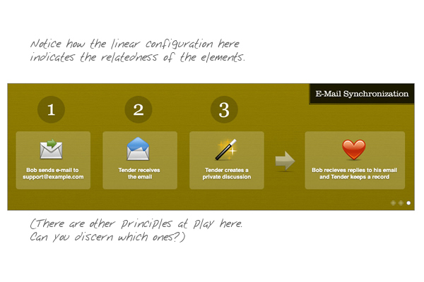
When designing a web page, we designers will usually employ a mechanism that facilitates good continuation: the grid. A grid is most useful in bringing order to a layout, but it also is useful in indicating context. For instance, the example below shows how a horizontal-linear configuration helps to preserve context:
In the above example, several thumbnails are presented under each portfolio category heading. The fact that the arrays are arranged consistently along a horizontal line under the category helps to make clear which thumbnails belong to which category.
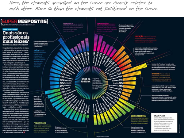
Linear arrangement for good continuation can also be vertical. For example:
In the image above, even though the content is not visually uniform, the clear vertical grid makes organization obvious. The content in the lower section of the layout is arranged according to category and even though there is no visible structure, each bit of content is clearly defined and easily associated with its appropriate category. All of this is made possible by the employment and perception of good continuation.
Conclusion
These principles are among the more fundamental of the Gestalt Principles. They reference ideas that we all intuitively understand, so you should have no trouble bringing these principles into your design work automatically and intuitively. Whatever else you do to achieve distinction and association among design elements, Gestalt Principles should be utilized as the foundational mechanisms.
By now youve realized that the different principles often work toward the same result, but each has its own unique character, context, and strength. Make a practice of being efficient in your application and exploitation of these principles; use the least amount possible. Dont employ three of them when one will do. That way, you work to maintain elegance and invisibility. And design should almost always be elegant and invisible. It follows that efficiently applied fundamentals are always superior to heavy-handed stylistic techniques. I hope, therefore, that you look beyond this article and the ones previously presented and continue to research Gestalt Principles and find ways to apply them in your work.
Proximity
Artikel aus: graphicdesign.spokanefalls.edu
Proximity occurs when elements are placed close together. They tend to be perceived as a group.

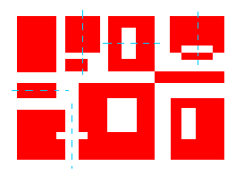
The nine squares above are placed without proximity. They are perceived as separate shapes.

When the squares are given close proximity, unity occurs. While they continue to be separate shapes, they are now perceived as one group.

The fifteen figures above form a unified whole (the shape of a tree) because of their proximity.
Das Gesetz der Nähe
xxx guter Artikel aus: www.kommdesign.de
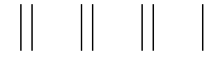
Dinge, die räumlich nahe beieinander liegen, werden von unserer Wahrnehmung gruppiert, also als zusammengehörig aufgefaßt. Dinge, die weit voneinander entfernt liegen, werden als getrennt und unabhängig wahrgenommen.

Wahrscheinlich sehen Sie hier 5 schmale Säulen. Dieser Eindruck wird durch Nähe vermittelt. Die Abstände zwischen den Linien, die gemeinsam eine Säule bilden, sind so gering, dass sie von unserer Wahrnehmung zusammengefaßt werden. Damit dieser Effekt zustandekommt, müssen die Distanzen zwischen den Säulen deutlich größer sein als die innerhalb der Säulen.
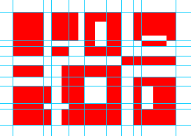
Das Gesetz der Nähe ist das einfachste Gestaltgesetz - was nicht so zu verstehen ist, es sei damit auch das unwichtigste. Verstöße gegen das Gesetz der Nähe können verheerende Auswirkungen auf die Verständlichkeit einer Website oder Benutzeroberfläche haben. Das betrifft nicht nur Buttons und Grafiken, sondern auch das Layout von Texten bzw. Links. Wie kann man sich einen solchen "Verstoß" vorstellen? Ich möchte es an einem vorher-nachher Beispiel verdeutlichen. Die folgenden Grafik zeigt einen verkleinerten Screenshot des Webkatalogs von "Lycos Comundo".
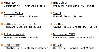
Hier (Original) ist alles in Ordnung. Die Links innerhalb der verschiedenen Gruppen bzw. Kategorien sind nach dem Gesetz der Nähe gruppiert. Die vertikalen Abstände zwischen den Kategorien (z.B. Finanzen, Sport) sind größer als die Abstände innerhalb einer Kategorie (Finanzen Versicherungen, Wirtschaft, Karriere).
Das folgende Beispiel zeigt noch einmal eine Layout-Variante des Katalogs. Diesmal wird das Gesetz der Nähe verletzt.

Die vertikalen Abstände der Kategorien sind hier verengt und auf gleiche Distanzen gebracht. Es wird weniger Fläche verbraucht, der Eindruck ist aber im Vergleich zu der großzügigeren Variante oben nicht vorteilhafter. Im Gegenteil: Die Orientierung wird erschwert.
Das Bilden von Kategorien in Menüleisten ist ebenfalls ein Gestaltungsproblem, das mit Hilfe des Gesetzes der Nähe gelöst werden kann. Wenn man Informationen geschickt anordnet, lassen sich Leisten und Subleisten ganz ohne Rahmen und Buttons definieren, nur durch den Einsatz unterschiedlicher Abstände.

In diesem Menü wird das Gesetz der Nähe genutzt, um die Auswahlmöglichkeiten sichtbar und selbsterklärend zu kategorisieren. Sehen wir uns die Sache einmal etwas genauer an. Es gibt hier...
- 1. Das Home-Link
- 2. Einen Leerraum
- 3. Die Gruppe der Produkt-Links
- 4. Einen zweiten Leerraum
- 3. Die Gruppe der Links, welche die Kommunikation zwischen Anbieter und Besuchern betreffen.
Wie es das Gesetz der Nähe vorschreibt, sind die Abstände zwischen den Kategorien deutlich größer als die Abstände innerhalb der Link-Listen.
Die Logik, die hinter dem Gesetz der Nähe steckt und die gezeigten Beispiele machen etwas sehr wichtiges deutlich: Leere wird von unserer Wahrnehmung als Information verwertet. Sofern sie mit Überlegung eingesetzt wird, ist sie also keine Platzvergeudung, sondern ein Gestaltungsmittel, das dabei hilft, Informationen sinnvoll zu ordnen und verständlich zu machen. Es ist demnach also wenig sinnvoll, Informationen auf einer Website endlos zu verdichten, um möglichst viel Inhalte auf möglichst kleinem Raum unterzubringen. Leerräume sind das, was die Pausen in der Musik sind. Sie tragen Bedeutungen.
xxx
xxx guter Artikel aus: xxx
xxx
xxx
xxx
xxx
xxx
xxx
xxx
xxx
xxx
xxx
xxx
xxx
xxx guter Artikel aus: xxx
xxx
xxx
xxx
xxx
xxx
xxx
xxx
xxx
xxx
xxx
xxx
xxx
xxx guter Artikel aus: xxx
xxx
xxx
xxx
xxx
xxx
xxx
xxx
xxx
xxx
xxx
xxx
xxx
xxx guter Artikel aus: xxx
xxx
xxx
xxx
xxx
xxx
xxx
xxx
xxx
xxx
xxx
xxx
xxx
xxx guter Artikel aus: xxx
xxx
xxx
xxx
xxx
xxx
xxx
xxx
xxx
xxx
xxx
xxx
xxx
xxx guter Artikel aus: xxx
xxx
xxx
xxx
xxx
xxx
xxx
xxx
xxx
xxx
xxx
xxx