Figur und Grund
sehr guter Artikel aus: Graphic Design - The New Basicgdbasics.com
Figure/ground relationships shape visual perception. A figure (form) is always seen in relation to what surrounds it (ground, or background)letters to a page, a building to its site, a sculpture to the space within it and around it, the subject of a photograph to its setting and so on. A black shape on a black field is not visible; without separation and contrast, form dissapears.
People are accustomed to seeing the background as passive and unimportant relation to a dominant subject.Yet visual artists quickly become attuned to the spaces around and between elements, discovering their power to shape experience and become active forms in their own right.
Graphic Designers often seek a balance between figure and ground, using this relationship to bring energy and order to form and space. They build contrasts between form and counterform in order to construct icons, illustrations,logos,compositions, and patterns that stimulate the eye. Creating figure/ground tension or ambiguity adds visual energy to an image or mark. Even subtle ambiguity can invigorate the end result and shift its direction and impact.
Figure/ground also known as positive and nega- tive space, is at work in all facets of graphic design. In the design of logotypes and symbols, the distillation of complex meaning into simplified but significant form thrives on the taut reciprocity of figure and ground. In posters, layouts, and screen designs, what is left out frames and balances what is built in. Similarly, in timebased media,including multipage books, the insertion and distribution of space across time affects perception and pacing.
The ability to create and evaluate effective figu- re/ground tension is an essential skill for graphic designers.Train your eye to carve out white space as you compose with forms. Learn to massage the positive and negative areas as you adjust the scale of images and typography. Look at the shapes each element makes and see if the edges frame a void that is equally appealing. Notice how as the value of a text block becomes darker, its shape becomes more defined when composed with other elements.
Recognizing the potency of the ground, designers strive to reveal its constructive necessity. Working with figure/ground relationships gives designers the power to createand destroyform.

A stable figure/ground relationship exits when a form or figure stands clearly apart from its background. Most photography finctions according to this principle, there someone or something is featured within a setting.
Reversible figure/ground occurs when positive and negative elements attract our attention equally and alternately, coming forward, then receding, as our eye perceives one first as dominant and next as subordinate. Reversible figure ground motifs can be seen in the ceramics, weaving, and crafts of cultures around the globe.
Images and compositions featuring ambiguous figure/ground challenge the viewer to find a focal point. Figure is enmeshed with ground, carrying the viewer's eye in and around the surface with no discernable assignment of dominance. The Cubist paintings of Picasso mobilize this ambiguity.
Drei Aufgabenbeispiele:
Hinweis auf Quelle Kommunikationsergonomie
Figur-Grund-Unterscheidung: Fähigkeit des "Auseinandersehens" von Dingen, die für die Organisation der Wahrnehmung kennzeichnend ist; als mentaler Prozess erstmals von dem dänischen Psychologen Edgar Rubin im Jahre 1915 erkannt und erörtert.
Figur und Grund. aus www.e-teaching.org
Nach Ansicht der Gestaltpsychologen ordnet die menschliche Wahrnehmung optische Sinneseindrücke in die Kategorien Figur und Grund.
Zu den Eigenschaften von Figur und Grund gehören (Goldstein, 2002):
- Eine Figur wirkt dinghafter. Man behält sie leichter im Gedächtnis als den Hintergrund.
- Die Figur steht vor dem Hintergrund. Der Hintergrund erstreckt sich hinter der Figur und wird als ungeformtes Material gesehen.
- Konturen, die eine Figur vom Hintergrund trennen, werden als Teil der Figur wahrgenommen.
Allgemein neigen wir dazu, symmetrisch geformte Bereiche als Figur wahrzunehmen. Auch konvexe (nach außen gewölbte) Bereiche werden eher als Figur wahrgenommen. Wir tendieren dazu, kleinere Gestaltkomponenten eher als Figur wahrzunehmen als größere. Selbst die Orientierung der Komponenten spielt eine Rolle, vertikal oder horizontal ausgerichtete Flächen werden mit größerer Wahscheinlichkeit als Figur wahr genommen.
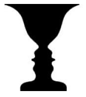
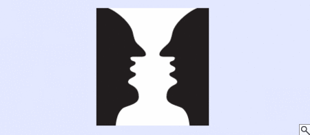
Kritisch für die Wahrnehmung von Inhalten wird es dann, wenn die Unterscheidung in Figur und Grund nicht eindeutig funktioniert. Ein anschauliches Beispiel hierfür sind die so genannten Kippfiguren: Je nachdem, ob man sich auf die schwarzen oder weißen Farbflächen konzentriert, erscheint ein anderes Bild. So sehen Sie links entweder eine Vase oder zwei Gesichter. Die Wahrnehmung oszilliert zwischen diesen beiden Eindrücken. Für ein gelungenes instruktionales Design ist daher eine deutliche Trennung von Figur und Grund zu berücksichtigen, damit funktionale Einheiten von den Studierenden auch als solche wahrgenommen werden können.
Doch nach welchen Eigenschaften unterscheiden wir zwischen Figur und Hintergrund? Dies lässt sich nicht pauschal beantworten, da hierbei weitere Gestaltgesetze eine Rolle spielen können. Allgemein neigen wir dazu, symmetrisch geformte Bereiche als Figur wahrzunehmen. Auch konvexe (nach außen gewölbte) Bereiche werden eher als Figur wahrgenommen. Wir tendieren dazu, kleinere Gestaltkomponenten eher als Figur wahrzunehmen als größere. Selbst die Orientierung der Komponenten spielt eine Rolle, vertikal oder horizontal ausgerichtete Flächen werden mit größerer Wahscheinlichkeit als Figur wahr genommen.
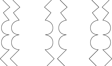
Links: Die beiden identischen Konturen verlaufen parallel.
Mitte: Spiegelt man eine der Konturen symmetrisch wird eher der Eindruck einer holistischen Figur vermittelt.
Rechts: Hier wird der Eindruck einer Figur noch mehr verstärkt, weil eine konvexe Gestalt erkannt wird.
xx
xx
Objektwahrnehmung und Gestaltgesetze
sehr guter Artikel aus: www.ch-becker.de - Vortragsseminar
Figur Grund Unterscheidung
Die Figur-Grund-Unterscheidung (FGU) ist die graphische und räumliche Organisation von Einheiten, dies geschieht i.d.R. unter Bildung einer Makroeinheit. (Wenn wir z.Bsp. viele Menüpunkte auf dem Bildschirm haben, so gruppieren sich diese zu einem Menü.... Menü wäre hier die Makroeinheit).
Die Beschreibung der Gruppierung von Reizmerkmalen einer Anzahl von Wahrnehmungselementen oder Figuren ist Aufgabe der FGU. Die Prinzipien der FGU beinhalten objektive Bedingungen der perzeptuellen Wahrnehmung unseres Wahrnehmungsfeldes.
Die kleinere Einheit wird eher als Figur vor einem größeren Hintergrund wahrgenommen als umgekehrt. Die Figur liegt dabei phänomenal vor dem Hintergrund.
Pop-up vor leerem Grund ist besser zu erfassen als maximiertes Fenster.
Die dunklere Einheit wird eher als Figur auf einem helleren Hintergrund wahrgenommen als eine hellere vor dunklem Grund.
schwarzer Text auf weissem Bildschirm (Papier)
Eine räumlich zentrale Einheit wird eher wahrgenommen als eine periphere.
Anmelde- und Hinweisfenster
Eine Einheit mit einer vertikalen (Abb. 13)oder horizontalen (Abb. 14) Hauptachse wird eher als Figur wahrgenommen als eine mit obliquer Hauptachse. Dabei ist die Wirkung einer vertikalen grösser, als die einer horizontalen.

Eine symmetrische Einheit wird eher als Figur wahrgenommen als eine asymmetrische (Abb. 15). Die Symmetrie um die senkrechte Mittelachse hat eine stärkere Wirkung als jede andere.

Eine Einheit mit konvexen Rändern wird eher als Figur wahrgenommen als eine mit konkaven (nach innen gewölbten) Rändern (Abb. 16).
Die Figur-Grund-Beziehung
mäßiger Artikel aus: kadekmedien.com
Die Figur-Grund-Beziehung ist eines der Gestaltgesetze. Es besagt, dass eine Figur nicht unabhängig von ihrem Hintergrund wahrgenommen werden kann. Vielmehr unterscheidet der Mensch Wesentliches von Unwesentlichem innerhalb einer wahrgenommenen Ganzheit. So wird eine kleinere Fläche eher als Figur und die sie umgebende größere Fläche als Hintergrund wahrgenommen.
Hebt sich die Figur eindeutig vom Grund ab, wird ihr mehr Aufmerksamkeit gewidmet und sie bleibt auch stärker im Gedächtnis haften als der dazugehörige Hintergrund. Man spricht dann von einer stabilen oder eindeutigen Figur-Grund-Beziehung. Die eindeutige Figur-Grund-Beziehung ist für einen Grafikdesigner von besonderer Wichtigkeit, da sie wesentlich für das Verständnis eines Bildinhaltes oder Layouts ist.
Eine mehrdeutige Figur-Grund-Beziehung hingegen besteht immer dann, wenn mehreren Wahrnehmungsmöglichkeiten eine gleichwertige Bedeutung zukommt. Mehrdeutige Figur-Grund-Beziehungen erscheinen dem Betrachter unverständlich und/oder langweilig.
Das bekannteste Beispiel für eine mehrdeutige Figur-Grund-Beziehung ist sicherlich die nach dem dänischen Psychologen Edgar John Rubin benannte Rubinsche Vase. In dieser Abbildung sind zwei Informationen enthalten: sowohl eine weiße Vase auf schwarzem Grund als auch die Schattenrisse zweier sich anblickender Köpfe vor weißem Hintergrund.
Die wichtigsten Merkmale einer stabilen Figur-Grund-Beziehung sind:
- Die Figur hebt sich durch eine eindeutige Form vom eher formlosen Grund ab
- Der Grund setzt sich auch hinter der Figur fort
- Figur und Grund können nicht zugleich wahrgenommen werden
- Meist wird die kleinere Fläche als Figur und die größere als Hintergrund interpretiert
- Die Figur erscheint näher und an einer eindeutigen Position im Raum, während der Grund keine eindeutige Position im Raum einnimmt und weiter weg erscheint
- Nahe beieinander liegende, ähnliche Elemente werden zusammengefasst als eine Figur wahrgenommen
- Symmetrische und geschlossene Formen werden bevorzugt als Figur wahrgenommen
- Elemente unterhalb einer Horizontlinie werden eher als Figur, jene über der Horizontlinie als Grund wahrgenommen
 Ich finde, das funktioniert nicht
Für einen Grafikdesigner sind die Gestaltgesetze allgemein von großem Interesse für die richtige Platzierung von grafischen Elementen im Layout. Mit Wissen um die Wirkung einer eindeutigen Figur-Grund-Beziehung kann der Grafiker dafür sorgen, wichtigeren Elementen in einem Entwurf größere Aufmerksamkeit zukommen zu lassen. So erscheinen gleichartige Elemente auf dunklem Grund größer und näher als auf als auf hellem Grund. Oberhalb der Horizontlinie werden grafische Elemente eher dem Hintergrund zugeordnet, während sie unterhalb der Horizontlinie eher als Figur wahrgenommen werden. Ihnen wird eine größere Bedeutung zugesprochen und sie werden sich auch leichter gemerkt.
Zur Geschichte von Figur und Grund
sehr guter Artikel aus: www.blelb.ch - Labor für Gestaltung zwischen Kunst und Technik
Dieses Schlüsselthema hat vor allem die Gestaltpsychologen des 19. und des 20. Jahrhunderts interessiert und zu verschiedenen Thesen verführt. Im 21.Jahrhundert scheint die bisweilen ein wenig doktrinäre Gestaltlehre von der langsam anwachsenden Wissenslawine der Neurophysik überrollt zu werden.
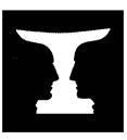
Der Kelch von Rubin
Einer der ersten Psychologen, welcher sich intensiv mit dem Thema Figur und Grund beschäftigt hat, ist der Däne Edgar Rubin. Nach ihm wurde dieser berühmte Kelch benannt[1], welcher in der Figur rechts zu sehen ist. Diese ambivalente Täuschungsfigur muss jedoch seit langem bekannt gewesen sein. Sie ist beispielsweise auf einem Bild von 1795 zu sehen. Eine Reproduktion findet man im Buch «Visuelle Intelligenz» von Donald Hoffman (Hoffman D, 1998,Visual Intelligence, New York, W. W. Norton & Co.)

Es gibt zwei Interpretationsmöglichkeiten:
Entweder wird der mittlere Bildausschnitt als Objekt «Kelch» im Vordergrund wahrgenommen oder er bildet nur den Hintergrund zu zwei symmetrisch angeordneten Gesichtsprofilen.
Bei der ersten Betrachtungsweise detektiert unser Gehirn die Krümmungsmaxima der konkaven Stellen des mittleren, grauen Objekts mit Hilfe selektiver Nervenzellen, gruppiert diese und generiert so die zentrale Figur «Kelch» mit den beiden Randkonturen im Vordergrund.
Im Gehirn müssen demnach Netzwerke von Nervenzellen existieren, welche derartige Objektteile (konkave Stellen und Krümmungsmaxima) gruppieren und zu einem Ganzen zusammenfügen. Erst dann entsteht die Interpretationsidee «Kelch».
Bei der zweiten Betrachtungsweise bilden die beiden Gesichter die Figur und beanspruchen die Randkonturen für sich (vergleiche dazu Bild 9 im Anhang zu Spot 1).

Interessant ist, dass die konkaven Stellen der ersten Betrachtungsweise jetzt konvex werden und die konkaven Stellen der Figur «Gesicht» anderswo liegen. Sobald die zweite Idee dem Betrachter plausibler erscheint, verliert der Kelch Form und Kontur und tritt in den Hintergrund.
Man kann niemals beides gleichzeitig sehen.
Merkmale von Figur und Grund
- Die Figur erscheint präsenter als der Grund.
- Die Figur wird vor dem Hintergrund gesehen.
- Der Hintergrund erscheint ungeformt.
- Trennlinien resp. Trennflächen zwischen Figur und Grund gehört stets zur Figur. Beim mentalen Vertauschen von Figur und Grund wechseln an diesen Stellen die kritischen Elemente (z.B. Krümmungsradien) ihre Vorzeichen.
Die visuelle Wahrnehmung ist ein aktives Auswahlverfahren, bei dem nur der wahrscheinlichste von verschiedenen konkurrenzierenden Bildentwürfen inszeniert wird. Die bedeutungsvollsten Bildausschnitte werden dabei zur Figur.
Die Interpretation «Figur» wird begünstigt, wenn der betreffende Bildausschnitt
- bedeutungsvoll ist,
- symmetrisch ist,
- einen eher konvexen Rand hat,
- eine prägnante (einfache) Form hat,
- eine Ansammlung von kleineren Flächen aufweist,
- übereinstimmende Farbkomponenten hat,
- plausibel ausgeleuchtet ist,
- vertikal oder horizontal orientiert ist.
Die nächsten beiden Bilder zeigen unter anderem den Einfluss der Farbe auf die Wahrnehmung von Figur und Grund.
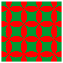
Im linken Bild sind die roten Teile prägnant. Sie lassen sich mühelos zu einer zusammenhängenden Figur im Vordergrund gruppieren. Die grünen Teile hingegen lassen sich nur lokal als Figuren auf einem rotem kreisförmigen Grund deuten. Die dominanten konvexen Begrenzungen der roten Elemente ziehen diese immer wieder in den Vordergrund.
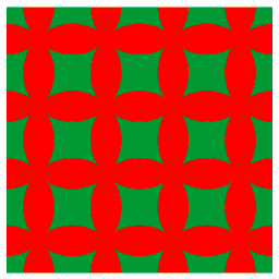
Im rechten Bild lassen sich die grünen Einzelteile, obwohl sie konkav sind, eher gruppieren und vor einem grünem Hintergrund wahrnehmen. Das bombierte rote Gitter ist hier als Figur weniger stabil. Es überlässt den Rand lieber den grünen Figuren. Zusammenhängende, gleichfarbige Elemente werden eher als Grund denn als Figur wahrgenommen.
Figur und Grund
gute Beispiele aus: vasarely.wiwi.hu-berlin.de - Bettina Berendt
Eine der grundlegenden und weitgehend `automatischen' Leistungen unseres Wahrnehmungssystems ist es, das Wahrnehmungsfeld in eine Figur und einen Grund aufzuteilen. Figuren werden als etwas Gegenstandsartiges gesehen; Grund nennt man den Hintergrund, von dem die Figuren sich abheben.
Es gibt eine Reihe von Eigenschaften des optischen Reizes, die eine Identifikation einer Form als Figur begünstigen. Insbesondere gilt, dass unter sonst gleichen Umständen das als Figur gesehen wird, das folgende Eigenschaften hat:
- relativ kleiner

- mit geschlossener Kontur

- symmetrisch<

- konvex

- besser strukturiert

- bekannte Form

- eher uneindeutig

Wahrnehmungsorganisation und ihre Analyse in der Gestaltpsychologie.
guter Artikel aus: www.namzu.de - Wahrnehmungsorganisation
Wahrnehmungsorganisation und ihre Analyse in der Gestaltpsychologie.
Wahrnehmungsorganisation meint die Gruppierung kleinerer Teile zu einem größerem Ganzen. Die Anfänge der Wahrnehmungsorganisation begründet die Gestaltpsychologie. Die "Vorläufer" der Gestaltpsychologie bildete die klassische Assoziationspsychologie. Die Vier Grundannahmen der klassichen Assoziationspsychologie. Max Wertheimer hat diese, mit Hilfe von Scheinbewegungen kritisiert, da diese nicht durch die klassische Assoziations Psychologie erklärt werden können. Und seiner Meinung nach wird die Wahrnehmung durch folgenden Satz charakterisiert:" Das Ganze ist mehr als die Summe seiner Teile.? Als Beispiel für diese Aussage kann man Scheinkonturen heranziehen, da diese physisch garnicht da sind. Die einzelenen Merkmale der Wahrnehmung werden mit Hilfe von Gestaltfaktoren zu einer Einheit zusammengefügt. Diese Gestaltfaktoren sind Faustregeln der Auswertung. Gestaltfaktoren:
- Der Faktor der Präganz (oder der guten Gestalt) besagt das jedes Reizmuster, so gesehen wird wird, daß die resultierende Struktur so einfach wie möglich ist.
- Der Faktor der Ähnlichkeit besagt ähnliche Dinge erscheinen zu Gruppen zusammengeordnet
- Der Faktor der Linienfortsetzung, Punkte die als Gerade oder sanft geschwunge Linie gesehen werden, wenn man sie verbindet, werden als zusammengehörig wahrgenommen. Linien werden tendenziel so gesehen als folgten sie dem einfachsten Weg.
- Faktor der Nähe, Dinge die sich nahe beeinander befinden, erscheinen als Zusammengehörig.
- des gemeinsamen Schicksals, Dinge die sich in die gleiche Richtung bewegen, erscheinen als zusammengehörig.
- Faktor der Bedeutung oder der Vertrautheit, Dinge bilden mit größerer Wahrscheinlichkeit eine Gruppe, wenn die Gruppen vertraut erscheinen oder etwas bedeuten.
Figur Grund Trennung
Es geht um die Trennung von einer Figur von ihrem Hintergrund. Und welche Faktoren das beeinflussen, was man als Figur bzw. Hintergrund wahrnimmt. Wichtig dabei sind Kippfiguren, die Möglichkeiten bieten verschiedene Figuren oder Hintergründe wahrzunehmen. Und die Eigenschaften von Figuren und Grund sind:
Von der Figur:
Dinghafter, leichter zu merken, und vor dem Hintergrund und die Konturen, die die Figur und den Hintergrund trennen, scheinen zur Figur zu gehöhren.Eigenschaften von Hintergrund:
Es ist ungeformtes Material und befindet sich hinter der Figur.
Was wird jetzt als Figur wahrgenommen? Und zwar symmetrisch geformte Bereiche, konvexe Formen, kleinere Flächen, vertikale oder horizontale Orientierung und bedeutungshaltige Gegenstände.
Unsere Wahrnehmung läßt sich aus ihrer Sicht dadurch erklären das elementar Einheiten je nach Helligkeit, Form, Farbe, Größe und Verteilung im Raum, größere Reizmuster bilden. Allerdings ist es so daß diese Regeln als heuristische Regeln zu verstehen sind, die nicht immer so gut funktionieren. Als Beispiel hierfür das Gesetz der Einfachheit sagt nichts darüber aus was die Kriterien für die Einfachheit sind. Das gilt nicht nur für die Einfachheit, sondern auch für die Ähnlichkeit und die Gruppierung, wo die Orientierung eine Rolle spielt. Diese Erklärungen sind meist im Nachinein entstanden. Deswegen kann man sie eher als heuristische Regeln verstehen. Die Gestalt Faktoren sind heuristische Regeln mit denen das System versucht komplexe Situationen durch die beste Schätzung zu lösen.
Algorithmische Lösungen, mit denen läßt sich eine sicher Lösung finden, allerdings kann man damit noch nichts über die Qualität und Dauer der Lösung aussagen. Die Voraussetzung dafür das unser visuelles System Heuristiken anwenden kann, unsere Welt ist geordnet, durch physikalische Kräfte, biologische Prozesse und soziale Interaktionen, und auf die Regelmäßigkeiten kann sich unser System verlassen. Und woher kommen diese Regeln ? Entweder durch Anpassung im Laufe der Evolution, durch Lernen oder durch beide, eine Mischng von Beidem.
Neuere Faktoren der Wahrnehmungsorganisation.. Einmal der Faktor der gemeinsamen Region, der besagt das Elemente die innerhalb einer gemeinsamen Region liegen werden zusammengruppiert. Der Faktor der Verbundenheit, Elemente die miteinander verbunden sind werden als Einheit gesehen. Der Faktor der zeitlichen Synchronisität, Elemente die zeitgleich erscheinen werden zu einer Einheit gruppiert. Bei der Wahrnehmung von Schatten gilt das im Normallfall das Licht von oben scheint.
Figur-Grund-Beziehung
Artikel aus: Mediengestalter/in Digital und Print (Dieser Artikel nicht mehr online)
Elemente werden entweder als Figur oder Grund wahrgenommen.
Der Bildteil, auf den Auge und Gehirn ihre Konzentration richten, wird als Figur bezeichnet. Der restliche Bildteil ist der »Grund«, der vom Betrachter undifferenziert und formlos wahrgenommen wird.
Die Figur tritt in der menschlichen Wahrnehmung in den Vordergrund, sie scheint näher zu sein und im Raum eine genaue Position einzunehmen. Elemente, die sich unterhalb einer Horizontlinie oder im unteren Bereich eines Designs befinden, werden daher eher als Figuren wahrgenommen.
Der Grund dagegen scheint weiter weg zu sein und im Raum keine genaue Position einzunehmen. Daher werden Elemente, die sich über einer Horizontlinie oder im oberen Bereich eines Designs befinden, eher als Grund wahrgenommen.
Das Design weist eine stabile Figur-Grund-Beziehung auf, wenn Figur und Grund eindeutig zu unterscheiden sind. So kann man die Aufmerksamkeit des Betrachters bewusst lenken, um wichtige Elemente für ihn leichter wahrnehmbar zu machen.
Differenzierung Figur/Grund
Artikel aus: www.designguide.at
Beispiel: M. C. Escher´s Figuren (keine Bespiele)
Ein Logo könnte missverstanden werden, wenn der Betrachter die "Figur-Grund-Differenzierung" falsch interpretiert. Wird diese Regel vom Designer nicht beachtet, kann es leicht passieren, dass der Betrachter ein Element das zum Logo, zur Figur gehören soll dem Hintergrund zuordnet, oder umgekehrt.
Grundsätzlich ist darauf zu achten, dass kleinere Flächen immer als Figur, größere als Hintergrund gesehen werden. Es ist weiters auch auf die Raumverteilung zu achten, die Verteilung von Schwarz und Weiss.
Auf dem Bild ist die "rubinsche Vase" zu sehen, sie wurde erstmals 1915 von dem dänischen Psychologen Edgar Rubin veröffentlicht. Zwei Bilder sind auf diesem Bild zu erkennen.
Einmal sieht man zwei Gesichter, die einander anblicken. Weiters kann der weisse Teil aber auch eine Vase darstellen. Zu sehen sind die Bilder aber immer nur abwechselnd, niemals gleichzeitig. Unser Gehirn ist nicht in der Lage, gleichzeitig Figur und Grund zu erkennen bzw. sehen.
Gesetz der Figur-Grund-Trennung
Artikel aus: www.kliniksprecher.de (Artikel nicht zu finden)
Beim Betrachten eines Bildes erfolgt vor der bewussten Wahrnehmung eine Figur-Grund-Trennung. Das Objekt der Wahrnehmung muss sich vom Umfeld abheben, damit wir sie wahrnehmen können. Diese Trennung bewirkt, dass eine Figur, also der relevante Gegenstand, sich von einem Hintergrund (Grund) abhebt. Ist dies nicht der Fall, können Wahrnehmungsobjekte mehrdeutig sein.
Was wir als Figur interpretieren und was als Grund, bestimmen die Gestaltgesetze. Kommen aber bei einer Anordnung mehrere Gestaltgesetze gleichzeitig vor, lässt sich das Ergebnis der konkurrierenden Wirkungen nicht vorhersagen. Ein deutliches Beispiel dafür stellt die Rubinsche Vase dar. Der Betrachter sieht entweder eine weiße Vase oder zwei Gesichter, die einander zugewandt sind. Es ist aber jeweils nur eine der beiden Sichten gleichzeitig möglich.
Figur-Grund-Gestaltgesetze
zusammenfassung: keine Quelle bekannt, Zusamenfassung von mir
Die Figur-Grund-Unterscheidung ist die graphische und räumliche Organisation von Einheiten. Dies geschieht unter Bildung einer Makroeinheit. (Wenn wir z.B. viele Menüpunkte auf dem Bildschirm haben, so gruppieren sich diese zu einem Menü.... Menü wäre hier die Makroeinheit).
Die Figur/Grund-Differenz ist deshalb elementar, weil sie eine fundamentale Strukturgegebenheit der Wahrnehmung ist. Es gibt die Figur, es gibt einen Ort für sie, und es gibt (drittens) dazu eine Umgebung, die charakteristischerweise flächig ist.
Die Figur-Grund-Beziehung ist eines der Gestaltgesetze. Es besagt, dass eine Figur nicht unabhängig von ihrem Hintergrund wahrgenommen werden kann. Vielmehr unterscheidet der Mensch Wesentliches von Unwesentlichem innerhalb einer wahrgenommenen Ganzheit. Hebt sich die Figur eindeutig vom Grund ab, wird ihr mehr Aufmerksamkeit gewidmet und sie bleibt auch stärker im Gedächtnis haften als der dazugehörige Hintergrund. Man spricht dann von einer stabilen oder eindeutigen Figur-Grund-Beziehung.
Es geht um die Trennung von einer Figur von ihrem Hintergrund. Und welche Faktoren das beeinflussen, was man als Figur bzw. Hintergrund wahrnimmt.
Und die Eigenschaften von Figuren sind: Dinghafter, leichter zu merken, und vor dem Hintergrund und die Konturen die die Figur und den Hintergrund trennen scheinen zur Figur zu gehöhren
Und die Eigenschaften von Hintergrund sind: Es ist ungeformtes Material und befindet sich hinter der Figur.
Was wird als Figur wahrgenommen? Symmetrisch geformte Bereiche, konvexe Formen, kleinere Flächen, vertikale oder horizontale Orientierung und bedeutungshaltige Gegenstände.
Unsere Wahrnehmung läßt sich aus ihrer Sicht dadurch erklären, dass elementar Einheiten je nach Helligkeit, Form, Farbe, Größe und Verteilung im Raum, größere Reizmuster bilden.
Elemente werden entweder als Figur oder Grund wahrgenommen. Der Bildteil, auf den Auge und Gehirn ihre Konzentration richten, wird als Figur bezeichnet. Der restliche Bildteil ist der »Grund«, der vom Betrachter undifferenziert und formlos wahrgenommen wird.
Die Figur tritt in der menschlichen Wahrnehmung in den Vordergrund, sie scheint näher zu sein und im Raum eine genaue Position einzunehmen. Elemente, die sich unterhalb einer Horizontlinie oder im unteren Bereich eines Designs befinden, werden daher eher als Figuren wahrgenommen.
Der Grund dagegen scheint weiter weg zu sein und im Raum keine genaue Position einzunehmen. Daher werden Elemente, die sich über einer Horizontlinie oder im oberen Bereich eines Designs befinden, eher als Grund wahrgenommen.
Das Design weist eine stabile Figur-Grund-Beziehung auf, wenn Figur und Grund eindeutig zu unterscheiden sind. So kann man die Aufmerksamkeit des Betrachters bewusst lenken, um wichtige Elemente für ihn leichter wahrnehmbar zu machen.
Eine der grundlegenden und weitgehend `automatischen' Leistungen unseres Wahrnehmungssystems ist es, das Wahrnehmungsfeld in eine Figur und einen Grund aufzuteilen. Figuren werden als etwas Gegenstandsartiges gesehen; Grund nennt man den Hintergrund, von dem die Figuren sich abheben.
Figur-Grund-Beziehung
Zusammenfassung (von mir aus mehreren Quellen, Quellen unbekannt)
Merkmale der Figur
- bedeutungsvoll ist
- symmetrisch ist,
- einen eher konvexen Rand hat,
- eine prägnante (einfache) Form hat,
- eine Ansammlung von kleineren Flächen aufweist,
- übereinstimmende Farbkomponenten hat,
- plausibel ausgeleuchtet ist,
- vertikal oder horizontal orientiert ist.
Es gibt eine Reihe von Eigenschaften des optischen Reizes, die eine Identifikation einer Form als Figur begünstigen:
- relativ kleiner
- mit geschlossener Kontur
- symmetrisch
- konvex (nach aussen gewölbt)
- besser strukturiert
- bekannte Form
Eigenschaften von Figuren :
- Dinghafter
- leichter zu merken
- vor dem Hintergrund
- die Konturen, die die Figur und den Hintergrund trennen, scheinen zur Figur zu gehören
Eigenschaften von Hintergrund :
- ungeformtes Material
- befindet sich hinter der Figur.
Was wird als Figur wahrgenommen?
- Symmetrisch geformte Bereiche
- konvexe Formen
- kleinere Flächen
- vertikale oder horizontale Orientierung
- bedeutungshaltige Gegenstände
Die Figur-Grund-Beziehung
sehr guter Artikel aus: www.andreashurni.ch
Gute Gestalten treten stets als Figur hervor, die übrigen Sehreize werden zum Grund, von welchem sich die Figur abhebt. Die Figur ist begrenzt, bestimmt, fest und tritt hervor. Durch die nicht erfolgende Zusammenfassung zu Gestalten ist der Grund entsprechend unbegrenzt, unbestimmt, offen und tritt zurück.
Eine eindeutige Figur-Grund-Beziehung trägt zu einer prägnanten Bildbotschaft bei. Mehrdeutige Figur-Grund-Beziehungen sind in diesem Zusammenhang zu vermeiden. Die flächenmässige Einteilung ist wesentlich für den Figurentscheid. Festzustellen ist, dass eher helle, symmetrische, konvexe oder kleine Flächen zur Figur werden, während dunkle, asymmetrische, konkave oder grössere Flächen zum Hintergrund werden." Also Vorsicht z.B. mit hellen Flecken im Hintergrund.
Ein (in meinen Augen) interessanter Nebenaspekt: Chaos im eigentlichen Sinne als vollständige Unstrukturiertheit ist weder wahrnehmbar noch vorstellbar, da jede Wahrnehmung und Vorstellung ein Ordnung bildender Prozess ist. Chaos ist somit völlig abstrakt.
FIGURE/GROUND
Artikel und Übung aus: daphne.palomar.edu
The relationship between figure and ground is one of the most important relationships in design. In simplest terms the figure is what you notice and the ground is everything else.
The design element of shape will also be discussed in this section.
The objectives of this lesson are to:
- Understand the characteristics of the design element shape.
- Learn the relationship between figure and ground.
- Design an obvious figure/ground relationship using a letter of the alphabet.
- Make an ambiguous figure/ground composition using the negative shapes from the letter project.
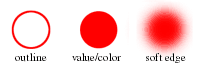
SHAPE
Shape, like the other design elements, is one of the visual tools used by designers. You will investigate the design elements during the second half of the semester. For now a shape is an area that is separate from other areas and/or its background. The separation can be by a boundary line or a change in value/color, texture or any other difference that lets you see that the shape is different. The boundary can be an outline or a distinct edge like cut paper, a rough edge like torn paper or a soft edge like a smear of charcoal.
FIGURE
The part of a composition that we pay attention to is called figure. The figure is also called a positive shape. In a simple composition there may be only one figure. In a complex composition there will be several things to notice. As we look from one to another they each become figure in turn.
Recognizable objects (subject matter) are easy to see as figure. In compositions without recognizable subject matter what we see as figure will depend on the abstract relationship between the visual elements. The most interesting at any moment is the figure.
GROUND
Everything that is not figure is ground. As attention shifts from figure to figure the ground also shifts so that an object can go from figure to ground and back.
Ground is sometimes thought of as background but this is not always true. In a flat composition there is nothing behind the figure (if there was there would be the illusion of depth). The shapes are side by side.
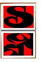
When the figure is surrounded by space in the composition the ground looks like a shape (the format) with a hole in it the shape of the figure (see example to the left). In this case the ground looks like a background for the figure and there is a shallow space developed. In this example the figure and ground are both visible even though the ground (red) is all that is shown.
If the figure contacts the edge of the format or other figure shapes the ground seems to surround the figure and a series of ground shapes are made. These are called negative shapes and no longer appear as a background. The space stays flat.
FORMAT
The area that a composition takes place in is called the format. The format is defined by it's size and shape. The format's edges are generally indicated by a border or the edge of the background color. The default format is the size and shape of the page or canvas that the composition takes place on -- unless that space is reformatted with a new design area indicated.
Choosing an appropriate format means choosing a shape and size for the ground.
FIGURE/GROUND RELATIONSHIP
The figure always defines the ground and the ground defines the figure. They are inseparable -- you can not have one without the other. If you draw the figure in a composition, you are drawing the ground at the same time (see "S" in red ground above). The edges of one are the edges of the other.
The classic face/vase illusion forces the viewer to shift from one figure to the other but not to see both as figure at the same time. When you see the faces as figure, the vase is the ground. When you see the vase as figure, the faces are the ground.
The figure/ground relationship is so important that an artist must consider all of the composition when designing. It is a mistake to only plan the figure. The entire area of the format must be given careful consideration or the image will be only partially designed. This is one of the points about design that this chapter and the next attempt to make clear.
If the entire area of the format can be made interesting, all of the shapes, spaces and/or objects appear as figure and 100% of the format is working visually. If only the subject matter, or main abstract shapes are carefully designed to look interesting, the designer is giving away the rest of the format space to stay as ground. A composition that is all interesting has an advantage over one that is only partially interesting.
OBVIOUS FIGURE/GROUND
Design an alphabet letter that fits in a rectangular format so that it touches all four sides. The letter must be easily recognized and occupy 50% of the space in the format.

Only two colors may be used: one for the figure and one for the ground. Any style of upper or lower case letter may be used.
The negative shapes from this project will be the visual information you use for the next project. There must be at least five negative shapes.
This and the next project will be displayed as a set.
THE LETTER
Look through books or magazines for a style of letter that appeals to you. Adapt an existing letter style or make up your own.

The letter must be recognizable so that it will be an obvious example of figure. Remember you will use the negative shapes from this project next time so design the letter with the negative shapes in mind. In other words, design the entire format -- both figure and ground.
DESIGN TIPS
There are many styles of type and more invented every day. Here are some concepts that are used in most letter designs:
Strokes:
The marks that make up letters all have names but can be summarized as strokes. Some letters use only one width stroke (gothic letters) but most use strokes of different widths. The wider strokes are usually vertical with the horizontal strokes thinner. The wide strokes give the form stability and are critical in the recognition of the letter. Observe letters to see where the different stroke weights are placed.
On letters with curves, especially script letters, the transition in stroke width is smooth and gradual. The gracefulness of a letter is greatly influences by where and how this transition is accomplished.
Waist:
The visual center of a letter is its waist. This is where the center of B, K and R, and the horizontal stroke of E and F are located. The waist is usually above the measured center giving the letter more weight on the bottom for stability. The lower areas are also usually wider than the tops for the same reason. Some letter styles violate this with very high (or rarer still, very low) waists-- but be cautious of this idea.
Consistency:
Unity is the goal of all designers. The parts of the letter and especially the decorative strokes (serifs) should be the same or compatible in style.
FITTING THE FORMAT
It might be necessary to stretch your letter somewhere to make it touch the sides of the box it is in. The top part of an S, or B, for example, is usually smaller than the bottom part so it might need widening. Narrowing the lower part may also work. The letter should touch all four sides of the format box.
Exaggerating part of a letter or tilting it can also help make it fit better. Strike a balance between fitting and the aesthetics of the letter's shapes (both positive and negative).
Cropping (cutting off part of the letter) can work if you are careful where you do the cutting. Most parts of a letter are necessary but some edges can be supplied by the viewer's imagination.
Remember to design both the letter (figure) and the negative shapes (ground). Both must be interesting for the image to work well.
HALF AND HALF
It is important for the next project that the negative shapes from this project use half of the format. Judging when your letter occupies 50% of the space is not easy. Look to see the same amount of each color (figure and ground). This is an aesthetic challenge since it will make the letter thicker than most type styles.


Thicken the main letter strokes while thumbnail sketching. Keep the letter readable and consistent in style. Pay particular attention to the width of every stroke in the letter. Make the curves smooth and changes in line weight gradual with the thick and thin areas in the appropriate places. Use a French curve if you have trouble drawing the curves freehand.
Adding to the decorative parts of the letter can fill space as long as the design is not compromised. Remember that the strokes that make up the letter should be the most visible.
Try changing the format shape to better fit the letter. Avoid an exaggerated (thin) rectangle since it will be more difficult to use on the next project.
NEGATIVE SHAPES
One of the points of this assignment is to point out that planning the ground shapes will help make the figure shapes more interesting. Remember that you are going to use only the negative shapes from this project in the next.
Strive to make all of the shapes in the design interesting. Variety is the spice of life -- make the shapes a little different in: shape, size , direction and/or proportion.

The more negative shapes, the better -- up to a point. Have the parts of the letter touch or overlap each other to make more shapes. Adding or exaggerating the serifs on the letter can be an effective way to do this.
Changing the proportion of an area so it touches the side of the box is another. Avoid any large shapes, especially long ones, since they will be difficult to use in the next project.
MAKING THE PROJECT
Use thumbnail sketches to find a design idea. Start with the letter and draw the format shape around it. Thicken the strokes of the letter to make it occupy half of the format area.
A full size rough will be needed. Draw the rough in your sketch book and adjust the proportions and details until you are satisfied with the composition. Construction paper comes 9 inches by 12 inches so it makes sense to make the finished product that size or smaller. There is nothing magical or sacred about a 9 by 12 inch format. Do not compromise your design to make it conveniently fit a piece of paper.
It will take three pieces of paper to make these two projects. One for the figure and ground shapes and two the same color for backgrounds. Cut all of the papers to the same size -- the size of the format.
Trace, transfer or cut up your rough and use it as a template to put the letter design on the color paper that is to be the letter (figure). Keep any marks light and easy to erase. Cut out the letter being careful to cut exactly on the line and to save all of the negative shapes (to use in the next project).
COLORS
Use two colors that will show well against each other. Color has the potential for psychological as well as visual impact. Choose colors that work well with the style of letter you designed. Both colors should show well against the white of the page or you will need a border. Avoid two colors that are the same value unless one is bright and the other dull.
BORDER
The project and the next will be displayed in the book on facing pages so that both are visible when the book is opened flat.
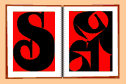
This project should come first so put it on the left page, or if a horizontal format is used for the letter, on the top page.
Figure and Ground
Artikel aus: graphicdesign.spokanefalls.edu
The eye differentiates an object form its surrounding area. a form, silhouette, or shape is naturrally perceived as figure (object), while the surrounding area is perceived as ground (background).
Balancing figure and ground can make the perceived image more clear. Using unusual figure/ground relationships can add interest and sublety to an image.
Figure
The word above is clearly perceived as figure with the surrounding white space ground.
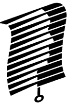
In this image, the figure and ground relationships change as the eye perceives the the form of a shade or the silhouette of a face.
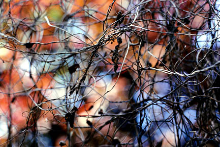
This image uses complex figure/ground relationships which change upon perceiving leaves, water and tree trunk.
Gestalt Principles of Perception:1 Figure Ground Relationships
Artikel aus: www.andyrutledge.com
Almost everything that makes graphic design work can be found in a set of laws and principles collectively known as the Gestalt principles of perception. There is no more powerful tool at a designers disposal than a comprehensive grasp of these principles. By the same token, those who dont have a good grasp of them are lost when faced with design projects and often go fishing on design gallery sites, being relegated to cliché motifs and layouts. But clients deserve better than our vague understanding. If you havent already, resolve to learn the Gestalt principles of perception.
Why learn this stuff? At the risk of sounding like a late night TV commercial, Gestalt principles of perception help to take the guesswork out of design. For instance, once the page content is defined and the communicative objectives are known, Gestalt principles make clear how to distribute elements on the page, when and why to use line delineation, background shading, a gradient, or when and why to group things in an enclosure (or not). Once you understand Gestalt principles, design becomes much simpler and your creative ideas will enjoy a far more effective articulation.
The name makes them sound complicated, but Gestalt principles are not so difficult to get your head around. In fact, each of them can be explained in one short sentence, but often theyre defined in ways that makes most peoples eyes glaze over. Well, I want to present them for you here in terms that directly relate to what Web designers do, supported by examples from the Web. This article is the first in a series concerned with better explaining these principles. Each will deal with one of them.
First, here are simple definitions for the Gestalt principles of perception:
Figure Ground Relationship
Elements are perceived as either figures (distinct elements of focus) or ground (the background or landscape on which the figures rest).Law of Prägnanz
Humans tend to interpret ambiguous or complex images as simple and complete.Uniform Connectedness
Elements that share uniform visual characteristics are perceived as being more related than elements with disparate visual characteristics.Good Continuation
Elements arranged on a line or curve are perceived to be more related than elements not on the line or curve.Closure
When looking at a complex arrangement of individual elements, humans tend to first look for a single, recognizable pattern.Common Fate
Humans tend to perceive elements moving in the same direction as being more related than elements that are stationary or that move in different directions.Proximity
Things that are close to one another are perceived to be more related than things that are spaced farther apart.Similarity
Things that are similar are perceived to be more related than things that are dissimilar.
Youll notice that most of these principles seem to be variations of each other and are otherwise closely related. Theres good reason for this, as they all refer to relationships. Human perception is governed by relationships; how things are similar or dissimilar, how they contrast or blend with one another, and how arrangements of things suggest hierarchies and are affected by context.
For designers, that last sentence pretty much sums up much of what you deal with in your job so it might be nice to get a handle on this stuff. Lets dive in and learn how to make Gestalt principles work for your designs.
Figure ground relationship
Elements are perceived as either figures (distinct elements of focus) or ground (the background or landscape on which the figures rest).
Why is it important?
Im talking about this principle first because it is likely the most important. Determining the figure ground relationship is also the very first thing people do when they direct their gaze; new things come into view and our brains need a basis upon which to make sense of things. We have to determine which elements are figures (requiring immediate concern and attention) and which are ground (not so important right now, but do provide context).
This process is of vital importance to humans and likely has its evolutionary basis in threat detection (am I walking on just leaves and weeds or am I about to step on a rattlesnake?). Of course, it also ensures that we are able to prioritize our perception so we dont go banging into things accidentally or ignore something of immediate proximity and importance. Our perception of the figure ground relationship allows us to organize what we see by how each object relates to others. The short and sweet version is: it allows us to determine what were supposed to look at and what we might safely ignore.
We do this instantly and without effort in most cases, as were often in familiar surroundings and looking at familiar things. But when we are made to look at something unfamiliar, especially if it is a designed page, figure ground relationship clues determine the success of our experience. This success is the designers mandate.
Specifics:
In the context of a website design our figure ground perception helps us to distinguish content from structure, perceive affordances, and understand the importance or implications of implied depth in a 2-dimensional medium. A designer can utilize a great many visual mechanisms and styling treatments in order to provide this sort of context and to communicate important clues to establish figure ground relationships. One can also exploit common figure ground perception conventions to confuse the layout in creative ways in order to add interest. Lets see some examples.
Examples:

In the very simple example above there are two different sorts of pictures, even though both images have identical composition. The picture on the left shows a gray object (figure) resting on a white field (ground). The picture on the right shows a gray object (figure) with a hole in it (all placed on the white background). These relationships are determined both by contrast and by common conventions of human experience and by other things, as well.
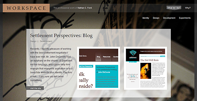
The image above from Nathan Ford's site presents a complex array of graphics, textures, colors, and shapes, but it works. Because of certain treatments to the various elements were able to quickly define what constitutes content (figure) and what constitutes structure and background (ground).

Regarding the examples above, one is successful and easy to understand and one is too complex to be effective. The two navigation arrays are identical in composition, but the one the left is quickly perceived to be text content (figure) resting on almost inconsequential background shading (ground). The array on the right is perceived as twice as many figures, since the structure and the content are composed of lines. In this case, lines are perceived to be content, so the structure competes with the content. The result is ugly and distracting.

In this example above, we must make a figure ground relationship decision in order to perceive affordance. Both of these objects are submit buttons, but the one on the left looks as if it could be just another part of the page structure or background shading. The button on the right graphically invites us and affords pushing/clicking. Shading and highlights have made clear what part of this is figure and what part is ground.

There can even be varying levels of hierarchy in the ground element. In the example above, Chuck Mallott effectively communicates levels of ground depth on his sites main page and, therefore, levels of hierarchy via the use of a drop shadow. The white area is on top, while the shaded area is at a lower depth. This combined with the shading and lowered contrast helps to communicate its slightly diminished importance in the overall page hierarchy.
Figure ground creativity
Working to establish clear relationships with figure and ground in a Web page layout is important, but clear delineations are not always best. A design can be imbued with interesting character and enhanced effectiveness by blurring these lines, so to speak. Here are a few examples of creative figure ground confusion.
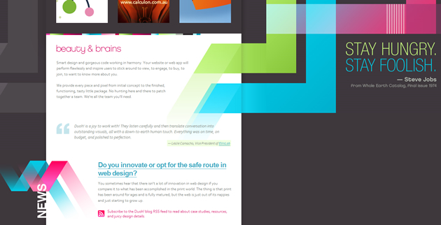
Veerle Pieters Duoh! site employs a wonderful array of graphics and text that seem to weave in and out of figure and ground. Whats more, cursor interactions with the content sometimes trigger transformations from figure to ground. The overall effect is stimulating and interesting. Its an example that seems to break the rules, but actually it just obeys deeper concepts within the rules, and to good effect.

David Lams main page would seem in some respects to be a complex array of multitudinous elements. But by way of contrast and taking into account peoples typical figure ground relationship determination, David has crafted a design where we quickly blur the background and see a very clean design and open layout. Playing with degrees of in-focus is the mechanism used here.
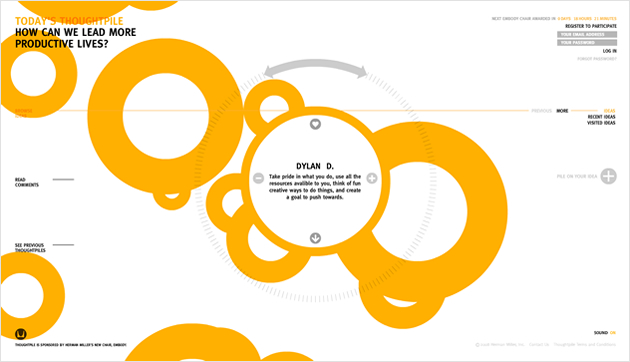
The thoughtpile.org site has an interesting design and an interaction mechanism that plays with relationships of figure and ground. With this site, these relationships seem to constantly change, with seeming ground elements turning out to be interactive figure elements. The effect is interesting, but this sort of thing can be overdone (and frequently is on flash-based websites). When doing this sort of thing, youve got to know your audience and your brand very well. This particular example would seem to be quite well done.
Homework
Many of the effects touched on in this article are components of other Gestalt principles and Ill get to those in subsequent articles. For now, begin working to consciously distinguish between figure and ground elements in designs and elsewhere. Start paying attention to your surroundings with a thought to this particular Gestalt principle. Developing this habit will pay great dividends and by applying these newfound insights youll soon begin to easily recognize why some designs or layouts work and why others do not; in both your own work and that of others.
References: 1. Universal Principles of Design, by William Lidwell, Kritina Holden, and Jill Butler
xxx
Artikel aus: xxx
xxx
xxx

xx
xxx
xx
xxx
xx
xxx
xx
xxx
xxx
Artikel aus: xxx
xxx
xxx
xx
xxx
xx
xxx
xx
xxx
xx
xxx
xxx
Artikel aus: xxx
xxx
xxx
xx
xxx
xx
xxx
xx
xxx
xx
xxx