The Principle of Balance
xxx guter Artikel aus: desktoppub.about.com - Principles of Design Class 2
The Principle of Balance
Primarily there are three types of balance in page design:
- symmetrical
- asymmetrical
- radial
Additionally, we'll discuss:
- the rule of thirds
- the visual center of a page
- the use of grids
...as we examine each type of balance and how to achieve it.
Symmetrie
xxx guter Artikel aus: Graphic Design - The New Basicgdbasics.com
xxx/ground relationships shape visual perception. A figure (form) is always seen in relation to what surrounds it (ground, or background)letters to a page, a building to its site, a sculpture to the space within it and around it, the subject of a photograph to its setting and so on. A black shape on a black field is not visible; without separation and contrast, form dissapears.
Prinzip der guten Gestalt:
Formulierung aus: www.stud.tu-ilmenau.de (nicht mehr online)
Einfachheit, Symmetrie, Regelmäßigkeit
BALANCE - SYMMETRY
Artikel aus: daphne.palomar.edu
Balance is concerned with the distribution of visual interest -- what is where in a composition.
There are two systems for controlling balance:
- Symmetry - a mirror image
- Asymmetry - without symmetry
In this lesson you will:
- Learn about symmetry.
- Make a symmetrically balanced composition.
BALANCE
Balance is a skill that everyone uses almost all of their waking hours. It is balance that allows you to stand up and walk around. You balance your checkbook and hopefully find a balance between your academic and social life.
Balance in design is similar to these kinds of balance. You have already had to balance between unity and variety, and in the last project balance figure and ground. Your physical sense of balance will play a part in your ability to balance the visual information in a composition.
It is necessary to balance many things in a composition: visual interests (this lesson), unity and variety, figure and ground, realism and abstraction as well as many logistical concerns (time, space, cost, etc.).
Visual interest is what you balance in design. Different colors, shapes sizes, etc. create different degrees of interest. It is the distribution of this interest that you need to control. We will study the abstract (non-figurative) aspects of balance to make it easier to understand how balance works. Subject matter changes the situation because different objects can call more (or less) attention to themselves because of their content and relationships to other objects in the image.
Balance can also be described as achieving equilibrium. The problem with this definition is that artists rarely want things to be equal. It usually means that no part of the composition calls too much attention to itself at the expense of the rest of the image. This increases unity, but decreases variety, and hence interest.
Balance is usually a desirable characteristic of a composition. There are times, however, when it is desirable to deliberately throw the balance off in order to call more attention to some aspect of an image. For this lesson we will attempt to achieve balance as a way of learning how to control attention in a piece of art.
There are two systems for achieving balance: symmetry and asymmetry.
SYMMETRY
Symmetry means a mirror image -- one side is the mirror image of the other. Symmetry can occur in any orientation as long as the image is the same on either side of the central axis.

This type of image has great appeal -- it makes for "good" shape relationship. Many people automatically gravitate to symmetry. We are symmetrical after all -- two eyes, two ears, etc.. Look around at consumer products and graphics (printed materials) to see how many use symmetry. You will find that it is the dominant organizational concept.
The word symmetry comes from the Greek roots syn, meaning with or together, and metron, meaning measure.
SYMMETRICAL BALANCE
Symmetrical balance is formal balance.
A vertical axis is required to achieve balance with symmetry. Part of the reason is that we have struggled throughout our lives to perfect our balance in order to stand, walk, ride a bike, etc.. To do this we must have exactly the same weight on both sides of our bodies. Our axis of symmetry is vertical and this makes a good model for symmetry in visual information.
Symmetrical balance is also called formal balance because a form (formula) is used -- a mirror image about a vertical axis. The results look formal, organized and orderly.
There is a strong emphasis on the center axis in symmetry since all of the information is reflected from there. This should be taken into consideration when designing with symmetry. It is easy to over emphasize the center.
Symmetrical balance guarantees left to right balance, which is the most important aspect of balance. But there is more to balance than that. Top to bottom balance is also important. Most images seem more stable if the bottom seems slightly heavier. If the top seems too heavy the composition can look precarious.
Balance between the center and the outsides of the image must also be considered. Fortunately our own sense of balance is usually good enough to feel when the balance in a composition is wrong. Pay attention to your own sense of balance and you will do well. Your sense of balance, like anything else, can be improved with practice and experience.
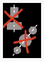
TYPES OF SYMMETRY
Symmetry means that the sides are exact mirror images of each other. This limits symmetry's application to abstract images since objects in the real world are not truly symmetrical. Try folding a leaf down the center and notice that the opposite sides do not exactly correspond with one another. Fine artists rarely use pure symmetry for this reason. It is more applicable to commercial designs.
NEAR SYMMETRY
Near symmetry is based on symmetry but the two halves are not exactly the same. Slight variations will probably not change the balance but there is more potential for variety and hence more interest. When the sides become too different, symmetry ceases to exist and balance must depend on other concepts (asymmetry).
Near symmetry is more versatile than pure symmetry. It is used in many graphic images since type throws off the symmetry but the balance is still achieved. It is also occasionally used for formal fine art images, especially early Christian religious paintings.
INVERTED SYMMETRY
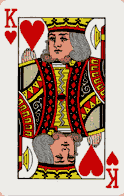
Inverted symmetry uses symmetry with one half inverted like a playing cards. This is an interesting variation on symmetry but can make for an awkward balance.
BIAXIAL SYMMETRY
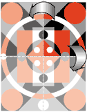
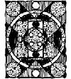
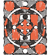
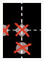
A symmetrical composition can have more than one axis of symmetry. Biaxial symmetry uses two axes of symmetry -- vertical and horizontal. These guarantee balance: top and bottom as well as left and right. The top and bottom can be the same as the left and right, or they can be different. The most regular and repetitive image occurs when they are the same.

More than two axes are possible. Snow flakes and kaleidoscopes have three axes of symmetry.
Radial symmetry is a related concept and can use any number of axes since the image seems to radiate out from the center, like a star.
UNITY AND VARIETY
Symmetrical images have a strong sense of unity because at least half of the image is repeated. At the same time they lack variety because only half is unique. A biaxial image is only unique in one fourth of its format since that fourth is repeated in all the corners.
When the top/bottom and left/right are the same, only one eighth is unique. As the repetition increases, so does the unity. In other words symmetrical images are usually well balanced and formal with good unity, but can lack excitement since they are so repetitive.
The strong sense of order and repetition make symmetrical images more acceptable to many people. That is why they are used so often in the applied arts. It is for the same reason that symmetry is rarely used in the fine artist. It is not that order is not wanted, but rather that variety is wanted to generate interest and to give the artist more freedom.
SYMMETRICAL COMPOSITION
Make a symmetrically balanced collage using only circles, triangles and/or rectangles. The shapes can overlap or be trimmed to make new shapes. Up to four colors may be used. The composition must have a vertical axis of symmetry. Biaxial symmetry may be used. There should be no reference to subject matter. Make the project as large as possible from a 9 inch by 12 inch piece of colored paper. One of the four colors can be used as a border.

Start with thumbnail sketches. Remember that there will be repetition so only half, or a fourth, of the image needs to be drawn. It is easier to see the composition, however, if the whole design is drawn. Plan on designing the major shapes and to experiment with the details once the collage is under way. Make some of the shapes quite large to increase variety.
Decide what colors you will use. Try stacking several sets of colored paper, varying the order and the amount of each that shows until you find a color scheme that will work. Try to make all of the colors equally visible, but vary the amount of each to get more variety.
Try to make all of the colors operate as figure in the design. Also try to make all the colors act as ground so that there is not one background. Use what you learned in the last project to control the figure/ground relationship.
Filling in the thumbnail sketches can make it easier to see color and value relationships. Use different values, or lines and dots, to indicate the different colors. Using colored pencils or felt pens will let you see more clearly what your design will look like. Be careful of white shapes that fade out into the background.
COLLAGE ROUGH
A full sized rough is not usually necessary, or desirable in this type of project. Move all of the parts of the composition around like you did for the ambiguous figure/ground project, trying different combinations, proportions and relationships before you are satisfied. Try taking pieces off. If they are not missed, leave them off. Also try adding more pieces if part of the image lacks interest. Working this way is called using a collage rough. A collage is not done until the last piece is glued in place.
Unity and balance are more or less assured. It is interest that you need to work toward getting. Use your sense of balance to determine if the image is correctly balanced. It should not look top or bottom heavy or be too crowded in the center or along the edges.
When you are satisfied with the composition, measure, mark and carefully glue the image together. Since there may be many layers of paper involved, either glue pieces from the top of the stack down or from the bottom up.
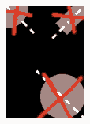
ASYMMETRY
Asymmetry, also known as informal balance, means without symmetry. You will study asymmetry next.
An a- at the beginning of a word means not or without. Asymmetry means without symmetry -- with no mirror imagery. It is possible to achieve balance without symmetry.
In this lesson you will:
- Learn some of the finer points of symmetry in order to avoid them.
- Make an asymmetrically balanced composition.
ASYMMETRICAL BALANCE
Asymmetry means without symmetry. That by itself has nothing to do with balance. It just means that there are no mirror images in a composition. The term, however, is usually used to describe a kind of balance that does not rely on symmetry: asymmetrical balance. There is no simple formula for achieving balance in asymmetrical balance (hence the term informal balance) so the designer must sense whether or not the composition is balanced. This is where your sense of balance really comes into play.
The composition either looks like it is balance or it does not. Where does your attention goes when you look at an image? If it seems to wander around more or less evenly, there is probably balance. If you seem to always come back to the same area, and that is not the center of the composition, then the balance is suspect.
One way to achieve balance that is almost a formula is to have more or less equally interesting things randomly distributed throughout the format. The effect is like confetti dropped on the area. There is balance because interest is evenly distributed, and there is unity. The problem is that everything is likely to seem too equal and hence too uniform. There is not enough variety and the design soon becomes boring.
It is possible to push the envelope of balance with asymmetry. A small visually interesting object can balance a much large less interesting object.

You can sometimes use nothing to balance something. Negative space has visual interest if used properly. Exact amounts and correct placement are required.

There are no rules or limits with asymmetrical balance. That does not mean that anything goes. Careful adjustments in size, shape, color and placement of the elements in the format are required before balance is achieved.
The attraction of asymmetrical balance to artists is its lack of a formula. This allow greater freedom which lends itself to more creative compositions. The difficulty lies in its lack of organization. This must be overcome by careful placement of objects and the use of other organizational devices (like figure/ground and, as you will soon learn, Gestalt principles).
ASYMMETRICAL COMPOSITION
Use the same format, kind of shapes and colors from the last project to make a new composition that does not use symmetry in any way. The image should be well balanced and displayed as a set with the symmetry project. No recognizable subject matter is allowed.

NO SYMMETRY
There are two reasons for not using symmetry in this project: to learn how to balance asymmetrically and to better understand what constitutes symmetry.
Symmetry is a very attractive design concept and some people have difficulty avoiding it. To help you understand more about symmetry and whether you can do without it, you need to know more about it's subtleties.
Types of symmetrical relationships to be aware of and avoid for this project include:
Centers -- do not put anything in the center of the format or any other object. That means along a center axis going in any direction. Be equally cautious about patting one object in the centers of another object.
Corners - do not put any object exactly in the corner of the format or any other object. There is an axis that runs through the center of a corner. Also be careful about using an object that looks like it is half on or over the edge of another object or the format.
Alignment - center axes continue out from a shape. Do not line up two or more objects on their center axes (this does not apply to two circles since they have axes in all directions -- the possibility of using two circles together would be eliminated). More than two circles in a line, however, still uses of symmetry.
For this project avoid using the center of anything as a reference for placement.
SUGGESTIONS
Try to make the largest shape at least 50 times larger than the smallest.
Start with a few L A R G E shapes that break up the background. Keep them different proportions for more interest. Add smaller and smaller shapes as you go, being careful to keep the overall image both balanced and interesting. Shape size is one of the few ways you have to create variety in an image where the shapes and colors are so limited.
Do not glue anything down until you are completely satisfied with the image
Try creating a flow or rhythm in the composition. The shapes should look like they are placed in relationship with each other and not just randomly distributed.
Use thumbnails to get the general idea then proceed to a collage rough to refine the composition.
Test the balance by turning the composition around, looking at it from several different directions. If it is well balanced, it will look balanced from any angle. There will, however, be one direction from which it looks best. That is because the top to bottom balance is not quite the same as left to right balance. A well-balanced composition will be slightly heavier on the bottom.
Symmetrie
Artikel aus: weblab.uni-lueneburg.de
Symmetrie
Achsen- und punktsymmetrische Formen haben hohe Prägnanz. Eine der prägnantesten Gestalten ist die auf eine vertikale Achse bezogene Symmetrie.

Symmetrie
Artikel aus: xxx
Nach dem Gesetz der Symmetrie ziehen symmetrische Anordnungen die Aufmerksamkeit des Betrachters spürbar auf sich. Eine symmetrische Anlage unterstützt demnach die klare Gliederung von Inhalten. Im gestaltpsychologischen Sinne ist eine wohlgeformte Balance dann erreicht, wenn die visuellen Elemente gleichmäßig auf den beiden Seiten einer Achse verteilt sind. Unausgewogene Screen-Designs stören dagegen die Betrachtung und können zu einer zusätzlichen kognitiven Belastung führen, also von der eigentlichen Lernaufgabe ablenken.
Chang, Dooley und Touvinen (2002) wendeten das Gesetz der Symmetrie für das Redesign einer Multimedia-CD zum Thema Wundversorgung an. Auf der Einstiegsseite fungiert eine Illustration als visuelle Achse, um die sich die einzelnen Menüpunkte symmetrisch gruppieren:
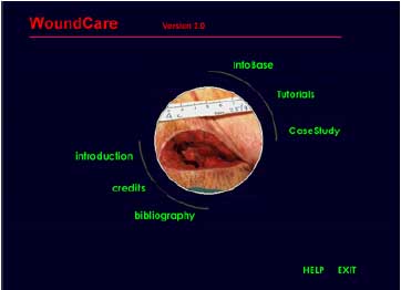
Abgerundet wird die harmonische Gestaltung durch die Platzierung des Titels und von HELP/EXIT in Flucht der gedachten Achse. Parallel wurden die einzelnen Elemente in der Mitte nach dem Gesetz der Geschlossenheit kreisförmig angeordnet, um die Funktionalität zu unterstützen.
xxx
xxx guter Artikel aus: xxx
xxx
xxx
xxx
xxx
xxx
xxx
xxx
xxx
xxx guter Artikel aus: xxx
xxx
xxx
xxx
xxx
xxx
xxx
xxx